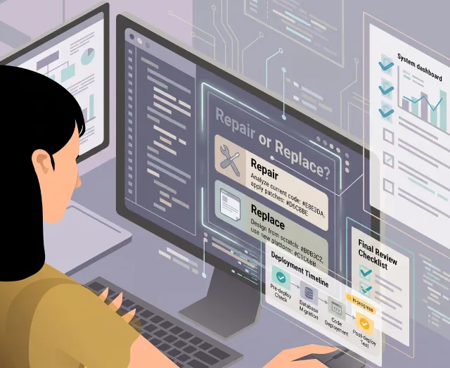
A visual identity has to work without the designer
A visual identity is easy to make look good on a screen. It gets harder when it has to go out into the real world – into a PowerPoint, onto an invoice, onto a sign someone edits themselves three years later.
A visual identity is easy to make look good on a computer screen.
It gets harder once it has to go out into the real world.
The logo has to go on the website. In a PowerPoint. On LinkedIn. In an email signature. On an invoice. Maybe on a sign, a van, a T-shirt, or something as mundane as a Word document someone edits themselves three years later.
And suddenly it's no longer the designer holding the file.
That's where you find out whether you've built a visual identity, or just a good-looking design.
It almost always starts with the nice version
When you're developing an identity, it's tempting to show it where it looks its best.
The logo sits with plenty of space around it. The typography lands perfectly. The colours are right. The photograph fits the composition. Nobody has written a headline twice as long as the one the designer used in the pitch.
You have to show the idea under decent conditions.
The problem starts if the identity only works under decent conditions.
Because reality rarely offers those.
A logo that looks fantastic at the top of a website can become unreadable as a profile picture on LinkedIn. A typeface that works fine on a Mac might not exist on the Windows machine where sales puts together a PowerPoint. A delicate colour that looks great on a calibrated screen can fall apart completely on an office printer.
And the graphic element tying the whole identity together in the brand guidelines can turn out to be nearly impossible to use in an email signature.
Those aren't the exceptions. That's the job.
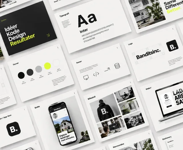
An identity is a system
I've always struggled a little with the idea that a visual identity is, first and foremost, a logo.
The logo obviously matters. But it's only one of the components that make a business look like itself.
Typography. Colours. Image style. Spacing. Hierarchy. Shapes. Icons. The way a headline sits. How much is allowed to happen at once. And just as important: what you consistently choose not to do.
Together, they form a system.
A good system doesn't mean everything has to look the same.
It means things can look different and still clearly belong together.
An invoice doesn't need to look like the website. A LinkedIn ad shouldn't look like a business card. A presentation has different requirements than a sign.
But you should still be able to feel that the same sender is behind it.
And the system has to survive the situations the designer never planned for.
Does the headline still work at 73 characters? Is the logo still recognisable at 32 × 32 pixels? Can an external supplier understand the system without calling the designer?
That's often where it becomes clear whether the identity actually holds up.
The brand guidelines aren't the identity
I've built brand guidelines with rules for logo, colours, typography, image use and production.
They're useful.
But a set of brand guidelines can also end up as a very nice piece of documentation for a system nobody can actually use in practice.
It can state exactly how much space the logo needs around it. That doesn't help much if the person putting together the next presentation can't find the right logo file.
It can list six RGB, CMYK and Pantone values. That doesn't help if nobody has decided which colour to use as the default in PowerPoint.
It can include four different logo variants. That doesn't help if nobody can tell which one to use when.
An identity doesn't get stronger by having more rules. It gets stronger by having the right rules. And sometimes by having fewer.
When others have to take over
This, in practice, is where a lot of my work with visual identity actually happens.
Not just designing something that looks right, but making it possible for other people to use it afterwards.
That might be a developer who has to translate colours, typography and spacing into components and CSS. A marketing person putting together a post. A salesperson opening PowerPoint. A print shop that needs the right PDF. Or a business owner who, on a Friday afternoon, has to change the opening hours on a sign themselves.
Those people don't necessarily need to understand every graphic decision behind the identity.
The system has to help them make roughly the right choices anyway.
That's where design stops being a deliverable and starts being something the business can actually use.
When everyone can suddenly produce graphics
AI sharpens the problem.
I wrote in Is my job as a graphic designer under threat? about how AI makes the actual production of graphics cheaper. That also means far more people within a business can produce something themselves.
Marketing can generate an image. Sales can put together a presentation. The CEO can get AI to make an illustration. An external partner can generate an ad.
Each individual piece can look fairly professional in isolation.
And together, the business can start to look like five different businesses.
That doesn't make the need for a visual identity smaller. If anything, it becomes more important to be able to describe what makes the business look like itself.
Colours and fonts are part of it. But so are image style, composition, tone and contrast.
In the past, this kind of framework existed so others could keep working with the identity without the designer sitting next to them. Now the framework also has to work when someone sets AI loose to produce something.
The difference between two prompts gets bigger:
"Make a professional image for our LinkedIn post" – versus – "Make something that clearly looks like us."
The second one requires there to actually be an "us" to look like.
It has to survive being used
The real test of a visual identity doesn't necessarily come when it's presented.
It comes six months later.
When someone has put a presentation together without asking. When the developer has built the next feature on the website. When a new employee has started. When a document needs printing on the office printer five minutes before a meeting. When AI has generated an image for a post. When the logo suddenly has to appear on something nobody thought about when the identity was built.
If the business still looks like itself there, the identity has started to prove its worth.
Because a visual identity shouldn't only look right when it's being presented.
It has to hold up once the designer is no longer in the room.
Visual identity
Visual identity for companies that need to look like something you can rely on.
49 years old, CTO, graphic designer, and full-stack developer (LAMP/LEMP) with 26 years of experience in developing digital solutions for a broad target group of companies.
From 2015 to 2023, I was CTO and co-founder of Lifeguard Health ApS. Here, I worked on the development of a digital health platform that combined technology, data and personal coaching. The role included everything from product development, UX and software architecture to management of development teams, operations and business development. The eight years at Lifeguard shaped my approach to both technology, products and people and today form the foundation for much of what I work with.
Read more↗
Watch Lifeguard's Core-story →
Lifeguard presentation_1_4_
03_Employment_history_
My experiences
From 1999 to 2026, I have worked in different roles with design, technology, and digital business. Here are 10 snapshots of that experience — the tasks I have solved, and the skills I have used along the way.
See them as cards, or explore periods and overlap on the timeline.
As shown in the previous section, I have dealt with a wide range of tasks and taken on many different job roles, ranging from sound engineer to photographer, graphic artist, web developer, and CTO. The common feature in all of them has been my passion for creating meaningful experiences and my drive to create something unique.
In my approach, I have always been open to exploring new solutions to existing challenges, and I have never been afraid to acquire new knowledge. This has resulted in a wide range of skills that I have put together over time.
I have tried to list the most relevant ones here.
Rating
- " This is what I do best".
- " I'm pretty good at it".
- " I can do this just fine".
- " It's not what I'm best at, but I can if necessary".
- " I'm not good at it - but I'm willing to learn".
I can open Figma and start drawing a website right away. It's rarely a good idea. Because before I know what the page should look like, I want to know what it should get someone to do.
When a page isn't found on Google, it's tempting to start with the copy. But before I'd change the content, I'd make sure Google can actually find the page, read it, and understand which version should show up in the search result. That's a large part of what technical SEO is about - technical problems can stand in the way of even good content.
A slow website can be a 4 MB image. It can also be 10 other things. The first question isn't what the site is built in – it's where the time actually goes.
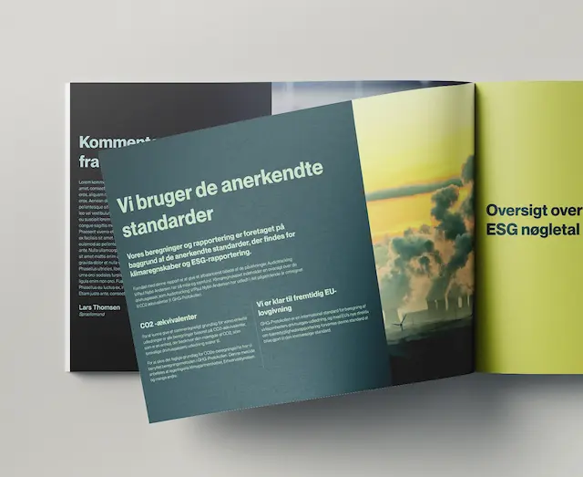
A visual identity has to work without the designer
A visual identity is easy to make look good on a screen. It gets harder when it has to go out into the real world – into a PowerPoint, onto an invoice, onto a sign someone edits themselves three years later.
AI-generated graphics have moved out of the computer and into the real world. The question is no longer whether AI can make graphics. It can. The question is what is then left of the graphic designer's work.
Valued at 35 million at its height, bankrupt in December 2023, a new company seven months later. This is what sat in between – and what I took with me.
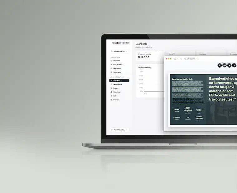
When we built ESGRapporter, the competition had heavier calculation engines than we did. We bet somewhere else: on what the user was left holding being worth showing to someone.
I was born and raised in Copenhagen. But after a few years living with small children in an apartment in Østerbro, my girlfriend and I chose to move to a house in the suburb. We've lived in Hellerup for 11 years now, in a less pulsating neighborhood but no further away from Copenhagen than you can hop on the bike and then you're back.
I often do the latter; it's all about inspiration and new impressions. For the same reason, I still try to combine these trips with my passion for shooting photos. But since work has always been my hobby, it has been a challenge to find a balance between leisure and work projects.
When I'm not working, I spend a lot of time playing and listening to music. Unfortunately, over time, it has mostly become listening, which has been a very expensive but also rewarding passion.
The common feature of all my passions is the desire to create something. I hope this can benefit you.
TL;DR:We built the ESG reporting platform in Laravel, and I carried the technical responsibility for the direction, the reporting side and everything visual.
The demand for ESG reporting increased significantly due to new EU regulations and a growing focus on documenting companies' environmental, social, and governance efforts. Many businesses suddenly faced extensive reporting requirements without having the internal resources or specialist knowledge needed to handle the process.
In the early summer of 2024, I was approached by three people working on the idea behind ESGRapporter. They lacked the technical foundation and a profile experienced in digital platforms, UX and product development. I was recommended for the role by a former investor from Lifeguard Health ApS, and on July 29th 2024 we founded ESGRapporter ApS.
The requirements
The requirements arrived with the CSRD directive and the ESRS standard that accompanies it. They hit the large listed companies first, but the effect travelled downwards fast: a large company has to report on its entire value chain, and suddenly its suppliers found a questionnaire in the inbox they could not answer. A manufacturer with thirty employees had neither a sustainability department nor the budget for a consultancy – but it did have a customer demanding the numbers.
The gap in the market
The market was already filled with solutions focused on data collection, compliance, and enterprise-level reporting. However, we identified a gap: there were very few user-friendly platforms where ordinary companies and non-specialists could create ESG reports themselves without being experts in ESG, legislation, or reporting structures.
The vision behind ESGRapporter was therefore to create an “ESG for dummies” platform – a solution where users could build reports step-by-step through a more intuitive process while also having the ability to present the final report in a visually polished and professional format. The goal was to make ESG reporting understandable and accessible for companies without specialised ESG knowledge.
The project drew heavily on the experience I had previously gained from working with complex platforms, onboarding flows, and user-centered digital product development.
My tasks
I held overall technical responsibility for the direction: which way the platform should go, and what to build when.
In practice I owned the graphic design, the reporting side and everything visual – built in Laravel, with the information architecture and user flows. The admin module was built by my colleague Samuel – partly to take some of the load off me, partly because he had years of Laravel experience behind him.
A significant part of the work involved transforming complex reporting requirements and abstract ESG concepts into concrete and user-friendly workflows. This included onboarding flows, dynamic forms, report structures, export functionality, and presentation design.
We used AI to help users formulate and improve descriptive report text based on their own input. The purpose was not to fully automate ESG reporting, but to make the writing process more accessible for users who were not used to writing report content themselves.
The project required both technical understanding, product insight, and the ability to balance compliance, design, usability, and commercial considerations.
TL;DR:I handled development, UI/UX and graphic identity. 60% of my time went to BmyGuest and IDoMeetings, which Revolvo co-owned.
From mid-2024 I worked at Revolvo ApS as a Senior Developer covering development, UI/UX and graphic identity. Around 60% of my time went to BmyGuest and IDoMeetings – two companies Revolvo co-owned – with the rest going to the agency's own clients.
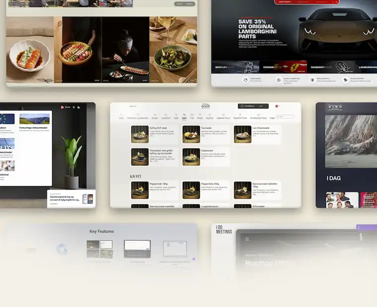
The role cut across disciplines that are usually split between several people: graphic identity and design at one end, frontend and backend at the other, with UX, technical analysis and debugging in between. Much of the work sat on top of established systems, where the existing codebase, the client’s business and the need for steady improvement all had to be reconciled. Clients included Egon, IDoMeetings, BmyGuest, ebillet and Formula Auto.
At Revolvo I worked on digital solutions for clients including Egon, IDoMeetings, BmyGuest, ebillet and Formula Auto. The work called for a pragmatic approach, often combining technical execution with a quick read on user experience, operations and commercial reality.
The stack changed from client to client – WordPress in one place, Umbraco or Magento the next – so part of the job was switching context without losing pace. It drew on my experience with SEO, performance, design systems and API integrations.
No greenfield
It is a condition of agency work that rarely gets said out loud: you inherit code you did not write, in systems you did not pick, for clients whose business you have a week to understand. There is no greenfield. There is a codebase, a history and a deadline.
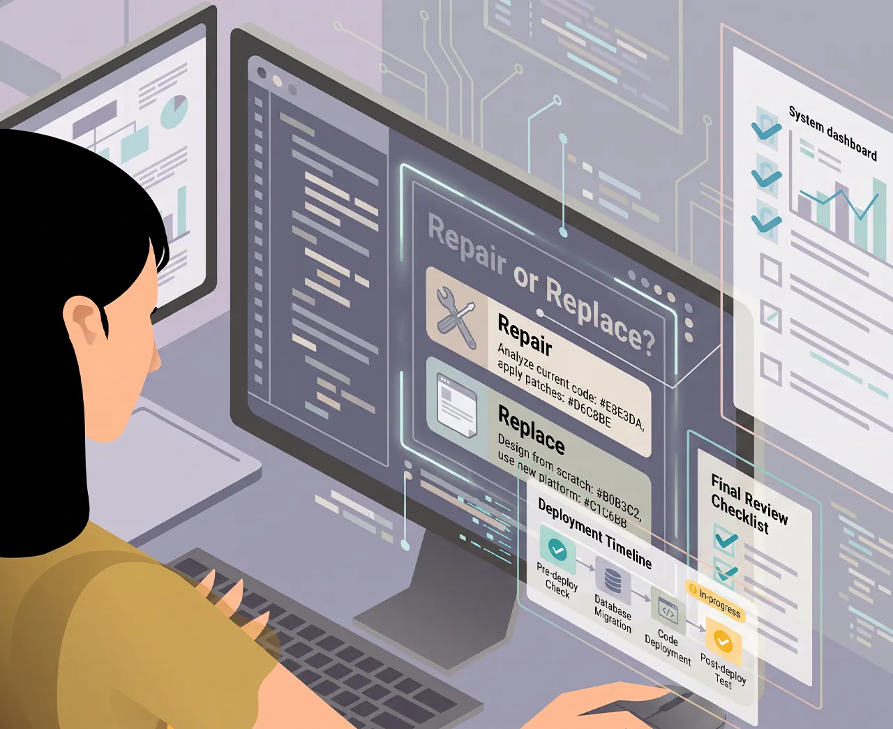
That suited me. After twenty years, the interesting part is rarely building something new from scratch, but working out why the existing thing does not work, and what it takes to fix it without knocking something else over. It requires reading unfamiliar code quickly, and being willing to push back when a client asks for something that is technically a bad idea.
C#, .NET and Umbraco
Egon.no ran on Umbraco, which meant C# and .NET – a stack I had not worked in before. After more than twenty years in PHP it was a reminder that a language is learnable; it is the domain and the codebase that take time. I took it on because the client was there, and because a statically typed language and a different way of thinking about architecture are worth having tried.
AI as a tool
This was also where I started using AI in daily work – first ChatGPT, later Claude, wired straight into Visual Studio Code and my git flow. Not to write code I do not understand, but for what a new stack costs the most time on: reading unfamiliar code, getting up to speed in an unfamiliar framework, and having something to argue against when a bug refuses to surface. It has become a fixture in the toolbox, on a par with a debugger.
The role suited my profile because it demanded both broad technical experience and the ability to get into a client's solutions, workflows and constraints quickly.
My tasks
The work was split by client, and each one came with its own stack and its own backlog. These are some of the ones I spent the most time on.
Egon
Implemented a new design and helped build the membership portal and the ordering flow, which covers the chain's 45 restaurants across Norway. Wrote the frontend files and cleaned up the CSS and UX along the way – the site runs on Umbraco, so this meant C# and .NET.
IDoMeetings
Built their website and cleaned up the frontend stack. IDoMeetings resells a platform to its own customers, so the template has to carry many different identities without forking into one version per client. I developed new templates and features – among them a dashboard giving staff an overview of every room and its status on a single map.
BmyGuest
The broadest brief: graphic identity, design, UX and code – frontend as well as backend. As with IDoMeetings the end product is a template each customer gets their own version of, so the design had to be loose enough to hold all of them and tight enough to still look like something.
ebillet
Designed and coded the views and partials for the portals ebillet provides to its customers. 90 cinemas run their ticket sales on the system. Umbraco again.
Formula Auto
Started as a pure design brief – design and UX for the European arm of Spares.net – and turned into a full Magento 2 template with the pages built out. The same brief followed for sparesusa.net. That site is not live yet, so the link points to my demo build.
Two machines, two worlds
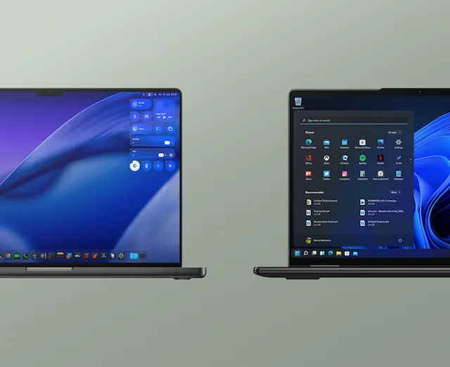
The real adjustment was not the language but the context. Egon and ebillet demanded .NET, meaning a PC and Visual Studio; everything else ran on my usual stack – a Mac with LAMP/LEMP.
Switching between the two machines several times a day took more attention than the C# itself. Each has its own shortcuts, its own tooling and its own way of doing things.
TL;DR:I built the LifeScore platform in Laravel with consent-based access to health data and an app for the wristband, and handled all UX and design.
I was the Co-founder and CTO at Lifeguard Health ApS. The company made it to its seventh birthday.
The idea
My partner and lead investor Mikkel Nybo Andersen had stepped down from the management of ContentCPH and sold his stake. He had an idea about making people healthier, and he needed someone who could carry the digital side and actually build it. We had worked together at the agency, so he knew what he was getting.
In 2015 Mikkel spent more than six months researching the market. We then began working on the concept, and on 23 May 2016 we founded LifeGuard Health ApS with the aim of creating a comprehensive and preventive B2B health concept with a holistic focusing on health, well-being, and performance. Our research showed that companies were already offering fitness subscriptions to their employees, but they had not been successful in motivating and retaining employees in a health program.
Digitising the coach
We recognized the opportunity to combine the best of both worlds: the digital world with the physical coach. By "digitizing the coach", we could deliver a scalable solution where many of the classic coach tasks could be moved into the digital domain.
This allowed us to combine automation principles and gamification known from existing health apps with people, creating results through a personal relationship. In collaboration with Morten Zacho, we developed a "Health Calculator" that could issue a numerical overall value for users' health with the help of onboarding data and ongoing input from both users and digital devices. This health calculation laid the foundation for all healthcare content.
LifeScore
Working with Morten Zacho, at the time working alongside Bente Klarlund at the Centre for Active Health, we developed the health calculation that became LifeScore. From onboarding data and continuous input from the user and their connected devices it computed three sub-scores – FitScore, DietScore and MindScore – which together produced a single figure for the user's health. LifeScore underpinned every piece of health content on the platform: it told the user where they stood, and the coach where to intervene.
The figure translated into three zones – green, amber and red. In practice it was an early-warning system: an employee heading for red was caught while something could still be done, rather than surfacing as sick leave six months later. That is the whole difference between prevention and treatment, and it was what the companies were paying for.
The platform and the app
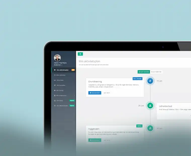
The platform itself was a Laravel web application with role-based access. Five roles logged into the same solution and each saw a different version of it: the user got their training sessions, their health score and their dialogue with the coach. The coach got an overview of their users and could set up programmes. The health care manager – a clinical adviser from the insurer – could see personal data on the users who had consented, and intervene. The company manager got reporting on the workforce as a whole, never on the individual. And the administrator held it all together.
One person could hold several roles and switch between them – a coach could also be a user. That sounds trivial, but it means permissions cannot hang on the user; they have to hang on the role you are logged in as. With health data in the system, that distinction is not academic.
Alongside it ran a mobile app, published on the App Store and Google Play. Its main job was not to be a second interface but to act as a bridge: it pulled data from the user's fitness tracker and passed it on to the platform, where it fed into the health calculation. Without that bridge the calculation was left with whatever the user typed in themselves – and self-reporting is notoriously optimistic.
Tested by 5,000
The algorithm and the coaching concept were beta-tested across user segments before launch. More than 5,000 Danes onboarded the first version and helped us calibrate the model – and it was that body of data that made the calculation credible enough to build a product on.
VitalityGuard
Six weeks after founding the company, a shortcut appeared. Together with Dansk Sundhedssikring we set up a joint venture, VitalityGuard, which resold the same platform to their customers under a different name and a different visual identity. The same codebase, the same LifeScore – a new identity on top. It forced us to build the platform white-label ready from the start, long before we could afford to think about architecture for its own sake.
The shortcut was their sales operation: Dansk Sundhedssikring already had the customers and the relationships, where we had the product and no sales force. It brought Maersk in as a client. The partnership was dissolved in 2018 over a disagreement about sales strategy, and we went our separate ways with a shared source code.
Reload and Berlingske Media
With covid having shut down B2B sales, we tried to compensate by going straight to the consumer market. We built a freemium platform – a free health test and health profile as a springboard for selling coaching – and struck an affiliate deal with Berlingske Media on a ”no cure, no pay” basis: we carried the development cost, they carried the media cost, with the tabloid BT as the main channel.
The traffic arrived. Over 100,000 visitors in a short space of time. The sales did not. After two months we put the project on hold.
The diagnosis was uncomfortable but clear: the audience did not match, and the media strategy was wrong. We had assumed reach alone would sell, and underestimated how much a recommendation from a person is worth against an advert in a publication. The platform itself survived, though, and large parts of it were reused in the core product – so the work was not wasted, only the business model.
The company
LifeGuard was far more than training; we also offered sleep and stress guidance with podcasts, videos, exercises, and coach dialog. At our peak, we had more than 25 employees – the Facebook page still stands as an archive of what we built. We had financial backing from the Growth Foundation and several investors, and were a part of the entrepreneurial environment of Health Tech Hub Copenhagen.
It was covid that broke the business. The market shut, and converting customers became close to impossible: budgets were uncertain, appetite for investment had gone, and the HR departments we sold to were busy holding together an organisation that had suddenly gone home. We had stretches of four to five months with no sales worth the name.
And when companies came back, they were somewhere else. Working from home had become normal, budgets had been rewritten, and wellbeing was something you discussed on Teams rather than something you invested in.
We kept it running for three years after the lockdown but never found our way back to growth. In December 2023 Lifeguard was declared bankrupt.
My tasks
As CTO I was responsible for conceiving and building the platform. The audience was broad and fitness trackers were in their infancy – that, combined with the technical limitations of parts of the audience, forced us to be creative with the solution.
Code, design and team
I wrote the Laravel code myself, did all the UX and design, and owned the technical architecture. Alongside that I ran a small, scalable team of Romanian and Armenian developers, where my job was to scope the work, brief the developers and review and assess their commits.
In practice it came to roughly 40% development and design, 40% operations and management, and 20% marketing – including social and email. That is startup life: the role is not what the business card says, it is whatever is left undone.
Wristbands and data
The technical core was the integration with the fitness wristbands. Every user got one, and the Lifeguard app pulled steps and sleep data out of the wristband's own ecosystem and passed them on to the platform. That sounds simple, but hardware is unreliable: bands go unworn, Bluetooth drops, batteries die. The calculation had to survive gaps in the data without handing the user a score that was obviously wrong.
The audience was broad, too. We sold to companies, not to technology enthusiasts, and a fair number of users had limited experience with apps. The onboarding had to carry someone who did not particularly want to be there.
The shop
We also sold hardware and subscriptions: Mi Band wristbands, body-composition scales and health packages running three, six or twelve months. It ran on Shopify, which I built and operated – first under Lifeguard, later under Reload – with the themes written in Liquid.
The trick was making it feel like one product. The shop sat inside the platform behind the same login and the same navigation, so the user never experienced leaving Lifeguard, even though two systems were technically in play. A purchase in Shopify had to become access in Laravel: order a health package and the subscription had to be activated, a coach assigned and the wristband shipped.
It looks trivial in a diagram. It never is in practice – least of all when a payment fails halfway and a user is left with a wristband but no login.
White label from day one
Six weeks after founding the company, the platform had to be able to carry a brand other than our own. That forced a separation of content, logic and identity I would otherwise have deferred – and which turned out to be the right call when the partnership with Dansk Sundhedssikring was dissolved and the source code had to be split.
GDPR
Regulation (EU) 2016/679 was adopted at almost the same moment we founded the company. We handled health data – the most sensitive category there is – and it is not an area where you can patch things up afterwards. It set the constraints for everything from the data model to who could see what.
The answer was to split access in two. The first consent was required to use the platform at all: it gave the company anonymised, pooled figures for the workforce as a whole – never for the individual. The second was optional and let the clinical advisers see personal data, so they could reach out to an employee heading for the red zone.
You could use the system without giving your employer any insight into your health, and you could decide for yourself whether you wanted help. That line was not a detail – it was the precondition for anyone daring to use the system at all.
The work was formalised. Lifeguard was among the very first companies to complete the full process and earn the D-seal – Denmark's certification for IT security and responsible data use, backed by the Danish Industry Foundation, the Confederation of Danish Industry and the Danish Business Authority. We were also selected for the Danish Design Centre's programme on the Digital Ethics Compass, on thinking about data and digital design responsibly.
Technically it rested on Laravel, where the framework supplies part of the security itself: hashed passwords, CSRF tokens, XSS protection. All data was encrypted – TLS in transit, AES-256 at rest – and access followed the Principle of Least Privilege, so no employee could see more than their role required. We ran SIEM monitoring around the clock and static code analysis on everything we deployed.
The GDPR documentation itself was produced under VitalityGuard, where we could afford to have the law firm Bech-Bruun at the table. When the partnership dissolved in 2018, the material did not come with us.
I rebuilt it from the ground up together with Thomas Bonefeld Jørgensen and Jan Lindquist from Unikk.me: data processing agreements, DPIA, master policy, IT operations policy, privacy and security policy. Without a lawyer this time – there was no budget. It forced me to understand the regulation rather than nod along to someone who had read it. A hard way to learn GDPR, but it sticks.
The chat was the worst of it. User and coach messaged each other inside the platform, and people tell someone they trust all sorts of things – divorces, illness, sleepless nights, things they have not told their employer. Structured data you can categorise and bound; free text you cannot. The messages had to be treated as the most sensitive part of the system regardless of what was actually in them.
TL;DR:We ran the Lifeguard platform white-labelled through a joint venture with Dansk Sundhedssikring. Maersk was the biggest client.
Six weeks after founding Lifeguard, we set up a joint venture with Dansk Sundhedssikring. The deal was in place almost before our own company had got going. The aim was to deliver Lifeguard's services and platform to Dansk Sundhedssikring's customers as a white-label solution we called VitalityGuard.
Technically, VitalityGuard was the same platform as Lifeguard. The same codebase, the same LifeScore calculation, the same coaching flow – with an entirely different visual identity on top. It is a cheap way into a new market, but it demands that the platform be built so the identity can be swapped without the code forking in two. It was also what later made it possible to split the source code when the partnership was dissolved.
At that time, Dansk Sundhedssikring was new to the market and had experienced potential growth through an aggressive sales strategy. We grew together, and I experienced being given more resources for development. At the same time, we made the back office available, and with all the opportunities this gave us, we were able to focus on core tasks.
This meant that Lifeguard's development and roadmap were transferred to VitalityGuard. It is worth owning: we moved the direction of our own product into a company we only half owned.
That is the hidden price of a joint venture. You gain access to a sales operation you could never have built yourself, and to resources a bootstrapped startup cannot afford – but you pay with control over what gets built when. As long as both parties want the same thing, you do not feel it. It is only when they do not that the price becomes visible.
My Energy
It did not take long before Maersk came on board. A client of that size brought demands on security and documentation that lifted the platform – and an onboarding on an entirely different scale.
To carry it outward we drew up a shared communication strategy we called MyEnergy.
The name outlasted us. Maersk kept MyEnergy running as the umbrella for their whole health programme – still alongside Danica Pension – and later had a standalone intranet built on the brand. It is quietly satisfying: the platform is gone, but the concept held.
The model tested
The zone system and the two-consent model were inherited from Lifeguard, but this is where they were put to the test. Danica's healthcare managers were the ones who acted on the optional consent: they could see personal data on the employees who had given permission, and reach out to those heading for the red zone. Maersk only ever got the anonymised figures for the workforce as a whole.
It is a model that only holds if all three parties respect it. An employer pushing to see individual numbers would have brought the whole construction down. That did not happen – and frankly, it was the single most important precondition for anyone signing up at all.
Splitting up
It worked for two years. Then we started pulling in different directions.
Dansk Sundhedssikring wanted to build broad and slow: more features, larger clients, a platform that could carry their whole portfolio. We wanted to sell what we already had, to whoever would buy it now. Every time the roadmap had to be prioritised, those two wishes were set against each other – and the roadmap sat in the joint company.
The disagreement was about sales strategy, but behind it lay two different economic realities. Dansk Sundhedssikring had capital behind them and could afford to build slowly towards a larger market. Lifeguard was bootstrapped and had to earn money now – not in two years. Neither of us was wrong; we simply could not afford the same thing.
In 2018 VitalityGuard was split in two. An agreement was made on shared source code, and we left with a sum of money to keep Lifeguard running. It was a decent ending – no lawsuit, no locked codebase – and it was only possible because the platform had been built from the start so the identity could be separated from the logic.
Two years later, covid closed the market we had been arguing about.
My tasks
The role was the same as at Lifeguard: I wrote the Laravel code, did the UX and design, and ran the dev team. It was the same platform, after all. What changed was who set the requirements.
VitalitySync
The app followed the same white-label logic as the platform: at Lifeguard it was the Lifeguard app, here it was VitalitySync. The job was the same – to bridge. The chain was long: the wristband only spoke to the manufacturer's own app, Mi Fit, and from there steps and sleep data had to travel on into our platform. VitalitySync sat in the middle and translated.
Maersk
With Maersk came a security regime we had not met before. We had roughly a month to meet – and document – a set of requirements well beyond anything we had imposed on ourselves. It was uncomfortable, but it was also what lifted the platform: demands from a client that size are a free security audit, if you take them seriously.
At the same time we had to onboard large groups of employees at once. That asks something different from taking one user at a time: of the technology, and of the digital support that has to catch the ones who stall.
GDPR
Regulation (EU) 2016/679 was adopted almost as we founded the company, and we had two years to become compliant. That work happened here, under VitalityGuard, where we could afford to have the law firm Bech-Bruun at the table.
We built data protection and privacy into the business processes, the value chain and the product lifecycle, and a technical setup to support it. It was thorough, it was expensive, and it was worth it – not least because Maersk arrived shortly afterwards with demands we could not otherwise have answered.
Resources
In return we got something a bootstrapped startup rarely has: more developer resources and a back office that took the administration. It is hard to overstate what it means not to be doing the bookkeeping and invoicing yourself when you are also the one writing the code.
TL;DR:I built 60+ Facebook apps in PHP for Samsung, IKEA and H&M. The Nik & Jay campaign for Samsung won Danish Internet Awards 2014.
ContentCPH was a creative agency. But a bit of a bastard. A hybrid between an advertising, media, digital and activation agency.
ContentCPH has, since 2006, preached that customers should focus more on creating consumer involvement via relevant content. It was about providing new channels for target groups and events.
In 2008, I was recruited as an external Flash programmer and graphic designer. Through 2008-2009 I freelanced for them, and in 2010 I came on permanently, responsible for the digital content.
We ran Facebook pages for several high-profile companies, and when the activities were at their peak, we had contact with almost 800,000 Danish Facebook users through 60+ Facebook apps – among them Samsung, Sony, IKEA, H&M and TV3.
Social media
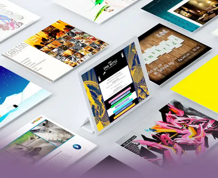
Back in 2010, the use of social media was growing. We had previously (2008) used MySpace to activate the Tiger Beer iPod Battle. But in 2010, Facebook was the one to use. We focused on activation and on the second screen – the screen the viewer held while watching TV. When viewers had watched the latest episode of ”Herre i eget Hus” or ”Masterchef”, they were invited over to Facebook, where they could interact with the show’s content, sign up for a roadshow with IKEA or Kvik Køkkener, or compete for a place in next year’s Masterchef.
The same move sat behind DFDS’ reality series on TV3: six episodes from the Oslo ferry, where TV3 followed the crew with no editorial control from the operator, and where social media carried the conversation on afterwards.
Samsung and Nik & Jay
We had a continuous and successful collaboration with Samsung Denmark. Among other things, I built a Facebook app for Samsung's activation of Nik & Jay. The app ran a countdown to the premiere of their new album UNITED: every time someone posted #pæntjatak on Instagram or Twitter, we took a minute off the clock. The audience could pull the release closer simply by making noise for it.
The countdown was eaten faster than expected, and the premiere moved 26 hours forward. I had to leave a family event in Tivoli to run it. That is the kind of miscalculation you want to make: we had counted cautiously, and the audience had not.
The campaign – activating Nik & Jay as ambassadors for the Galaxy S4 – won Danish Internet Awards 2014 in the Social Media category. We built it with Starcom and Universal Music. The jury cited ”an outstanding coordinated effort across multiple social channels” – activating Nik & Jay's fanbase and tying it to Samsung's products at the same time.
A festival camp with hot showers
Alongside this we also got Hennes & Mauritz on board, and from 2011 to 2013 ContentCPH handled the planning and execution of H&M Reboot Camp at Roskilde Festival.
Reboot Camp was a tent camp in support of Fashion Against AIDS: you bought a package with a pitched tent and breakfast, and a pop-up shop on site carried the collection. In 2011 that was 1,600 festival-goers in 800 tents, and the collection was more than 90 percent sold out by Thursday.
The point was that the camp looked nothing like the rest of the festival. Cofoco handled the food together with a sushi restaurant, and Joe & The Juice ran the lounge with food, drinks and entertainment – alcohol included, so for one week the bar was called Joe & the Booze. In the ChaChaCha styling salon professional hairdressers cut the guests’ hair, with the proceeds going to Aidsfonden. And there were hot showers.
It opened the festival to a whole new audience: people who wanted to be part of it, but not part of the mud pit. I have noted since that Roskilde Festival has increasingly built offerings aimed at exactly that segment.
On site I was part of the practical execution and the photo documentation.
My tasks
The title was ”Senior Digital Wizard”, which is the sort of thing an agency invents when the role does not fit a box. In practice I was the one who built what the others had sold.
60+ Facebook apps
The core of the job was Facebook apps in PHP. They look simple from the outside – sign up, upload a photo, enter the competition – but they had to be built again and again, for every campaign, with new rules, new data fields and a new deadline. Over five years it came to 60+.
That forces a kind of discipline. You cannot build 60+ apps from scratch and survive; you have to work out what recurs and build that once. It is the same lesson I later drew on at Lifeguard, when the platform had to carry two identities.
Everything else
Alongside that came flash and HTML banners for conventional media, static banners for Facebook, photo documentation of the live events the campaigns led up to, video editing, and advice whenever a client wanted something that could not be done.
TL;DR:I built campaign sites for Movia and the Danish Heart Foundation, among them Overraskende hurtig, which took bronze at the Creative Circle Award.
One of BOCCA's greatest strengths was the ability to tell stories. But back in 2009, the stories had moved over to the web. The solution to this was BOCCA // WIRED.
WIRED was a creative agency with a digital edge. In the two years they existed, they were a significant positive contributor to the BOCCA Group's financial result.
WIRED took home awards from the Creative Circle, the Danish Internet Awards, and the Webby Awards.
Overraskende hurtig
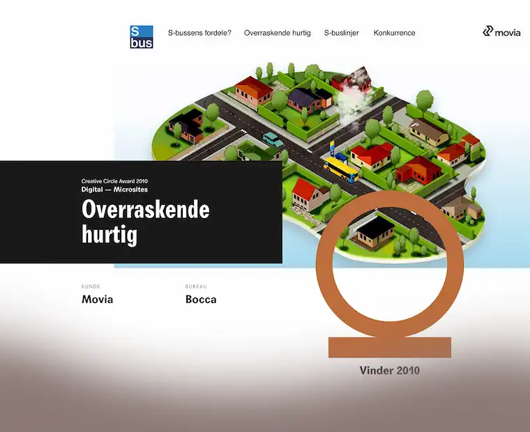
The campaign that ended up giving WIRED – and indirectly me – its first Creative Circle was ”Overraskende hurtig” (”Surprisingly fast”) for the Copenhagen transit authority Movia.
The task was to get more passengers onto the buses by making it tangible how far you could actually travel on the S-bus network. The campaign ran from late April 2009 across several weeks on outdoor, banners, bus wraps and a dedicated campaign site showing travel times and connections across the eight S-bus lines.
I was brought in by Mikkel Hyldenbrandt, Mikkel Würtz and Eskil Busck as an external Flash and PHP developer. Eskil and I had shared an office at Republikken, and we had already built the prelaunch site for L.O.C.’s Melankolia/XxxCouture together – so they knew what they were getting.
The campaign site was my part of the job. I built it together with a graphic designer and an art director – they handled the visual and conceptual side, I handled the development. It was awarded bronze in the Digital – Microsites category at the Creative Circle Award 2010 – a year when fewer than one in ten submitted works took any metal at all.
After only two years, WIRED was merged back into BOCCA Advertising Agency, driven by a wish to build a new agency with a stronger emphasis on owned media and digital campaigns.
In the meantime I had intensified my collaboration with a number of other agencies, among them BBDO, Verk and ContentCPH.
At the same time I was carrying a larger assignment for GN Netcom // Jabra, which I had taken over through EuroRSCG, and which demanded a good part of my time.
My tasks
From Photoshop to Flash
The workflow was the same every time: take the graphic elements, cut them up in Photoshop, import them into Flash and make the whole thing move. It sounds mechanical, but it is not – an art director draws what looks best, not what can be animated, and closing the gap between the two is what a Flash developer gets paid for.
The content lived in XML, not in the timeline
The S-bus campaign had to show eight bus lines, both directions, every single stop with its travel time and its connections to other lines. The standard Flash approach was to put all of that straight into the timeline. That would have meant hundreds of stops hard-coded into a file only someone with Flash installed could edit – and Movia revises its timetables twice a year.
So the content moved out of the movie and into XML. One schema per line, mirrored in both directions, where every stop was an element with a title, a travel time and a list of connections. The Flash file loaded those and built the display from them. The menu labels lived on their own, and the template for new lines sat as its own file, ready to be filled in.
The SEO was 2009 SEO
The price was visibility. A pure Flash site is a single file Google cannot read: no text, no links, no structure. All that tidy XML sat inside the player, where search engines never went.
The answer back then was meta tags – keywords in subject and dc.keywords, the list you wrote because that was how it was done. Google stopped listening to it soon after.
When HTML5 arrived the problem disappeared, and Flash went with it. It was a technology I spent years mastering that was dead five years later.
←BOCCA WIRED2009-2010Read more ↗↓↑→Makazilab2005-2006Read more ↗
Period: 2008-2010
Now: Havas Danmark
EuroRSCG
Inhouse Freelance developer
TL;DR:I won the agency's digital work back from the competitors and built an iPhone site and interactive product tools for GN/Jabra.
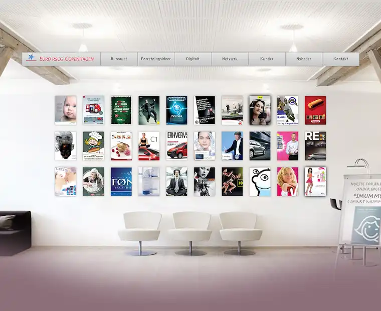
With over 300 offices in 75 countries, Euro RSCG was a top-five agency worldwide. But in Denmark, they lived a quiet life close to Vibenshus Runddel. As a network agency, they had several clients through their French parent company, including Citroën, Vichy and L’Oréal. These were supplemented by a solid portfolio of local brands – GN/Jabra, TV3, Vattenfall and Longo Vital among them.
Euro RSCG was strong on the creative discipline and delivered thorough work in classic media: ads, billboards, outdoor. But as the market moved, both clients and partners increasingly asked for digital formats and more flexible, technology-driven solutions.
The leap was bigger than it sounded. An ad is finished when it goes to print; a website has only just begun. It has to work in browsers that read the same code differently, it has to be fixed and extended after launch, and it reports numbers back on whether it actually works – numbers a billboard campaign was never measured on. With nobody in-house to translate between the creative brief and what could realistically be built, the digital parts of the work went to competitors, even when Euro RSCG had won the rest.
I had already been helping the agency with smaller digital jobs on an ongoing basis. But as the need grew and the work became both more frequent and more complex, I saw a clear opening to strengthen my own pipeline and position. So I left my shared office and took a desk of my own as an in-house freelancer at Euro RSCG. It put me next to both the creatives and the account managers, which meant getting into the work while it could still be shaped – rather than being handed a finished idea that then had to be forced into a technical reality.
My tasks
I was the agency’s digital voice – outwards towards the clients, and inwards whenever a creative brief needed a verdict on whether it could actually be built. The day-to-day production was online adaptations of what the agency already made: flash banners, online magazines in Flash, eCards and HTML mails. The agency’s own website sat with me as well.
Jabra
GN/Jabra was the client I spent the most time on. I built a standalone iPhone site – this predates responsive design, so the mobile version was a separate codebase with its own content.
Then came SoundLab and ComputeSpectrum, two interactive tools built in Flash. A headset sells on sound, but sound is hard to sell in print, and a specification in hertz means nothing to the person about to buy. The tools let the user hear the difference and see it as a curve at the same time – the product’s quality demonstrated rather than described.
On top of that came HTML mails and banner series in several language versions. I collected the recurring elements into a reusable toolbox with an accompanying design manual, keeping the visual language consistent across markets and cutting production time.
←EuroRSCG2008-2010Read more ↗↓↑→Bandits Inc.1999-2026Read more ↗
Period: 2005-2006
Now: MIND SWITCH
Makazilab
Co-founder & developer
TL;DR:Co-founder of Makazilab, where I built the technical side of three educational concepts on intelligence types, entrepreneurship and creativity for primary schools, supported by the Danish Ministry of Education and the Social Fund.
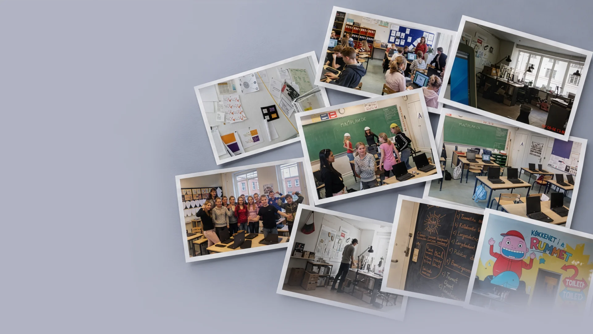
Makazilab was a company I started together with Ulrik With Andersen, who I had gotten to know when he joined Audiomanagement. We shared an office at Republikken, the same co-working space that later became the starting point for several of my other collaborations. My tasks and technical stack were similar to what I later built on further at Bandits Inc.
Ulrik and his collaborators were behind the three concepts we worked on — the idea, the pedagogy and the content were theirs. My job was to take the concept forward and make it real: build the technical solution that turned the idea into something a school class could actually use. All three were educational material aimed at primary schools, funded by a combination of the Social Fund, the Danish Ministry of Education, and the Selvstændighedsfonden (a Danish entrepreneurship foundation).
My tasks
Min1Plan
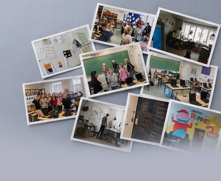
The first concept was Min1Plan — a Flash-based e-learning tool for grades 4-6, built around Howard Gardner's theory of multiple intelligences. My job was to build the entire technical solution: the seven exercises (four on the computer, three physical), each tied to one of the seven intelligences, plus the scoring logic that calculated which intelligences scored highest for each student along the way.
I also built the database behind Mit1CV, the tool's companion part, where students had their result matched against possible future occupations and built their own business card and CV based on them — along with teachers' access to the students' answers, which gave a more nuanced view of each student's learning style than the linguistic and logical-mathematical intelligence the school system has traditionally focused on.
Mød en Iværksætter
The second concept was "Mød en Iværksætter" ("Meet an Entrepreneur") — a series of five short films for grades 4-6 about entrepreneurial culture: one historical film on Danish entrepreneurial history, and four portraits of young entrepreneurs across very different industries. My job was to build the publishing solution on klassenshistorie.dk, where the films, a teacher's guide, a student template, and an overview of the curriculum objectives in the Danish UEA framework (education, career and labour market orientation) were made available to teachers nationwide.
I was also responsible for the technical side of the evaluation the project concluded with, delivered to the three foundations that had funded it.
Ideudviklerne
The third concept was Ideudviklerne, a Makazilab project where Ulrik (through his sole proprietorship, With Consulting) and Jesper Vej of Sejper1 delivered the concept and content. The background was a study from the Danish School of Education showing that 95-98% of all children use creativity and original thinking to solve tasks when they start school — a figure that had dropped to 5-7% by 9th grade. The project set out to teach students creative working methods, such as reverse brainstorming, through a recurring mascot concept: the cartoon character Einer Idé.
My job was to build the digital learning tools for the concept — two separate websites (eineride.dk), one for grades 4-6 built around the Einer Idé character, and one for grades 7-10 with a more neutral design focused on streamed vox pop films, quizzes, and downloadable teaching manuals. The project was piloted in a 5th-grade class at Højager Skole and a 9th-grade class at Rugvænget Skole, both in Ballerup Municipality, ahead of a nationwide launch.
←Makazilab2005-2006Read more ↗↓↑→Audio Management1999-2003Read more ↗
Period: 1999-2026
Now: Audiotracking v/Paul Nybo Andersen
Bandits Inc.
Sole proprietorship
TL;DR:My own sole proprietorship since 1999. Through it I have sold web development to agencies that had the graphics but lacked the developer.
Bandits Inc. is my own personal playground.
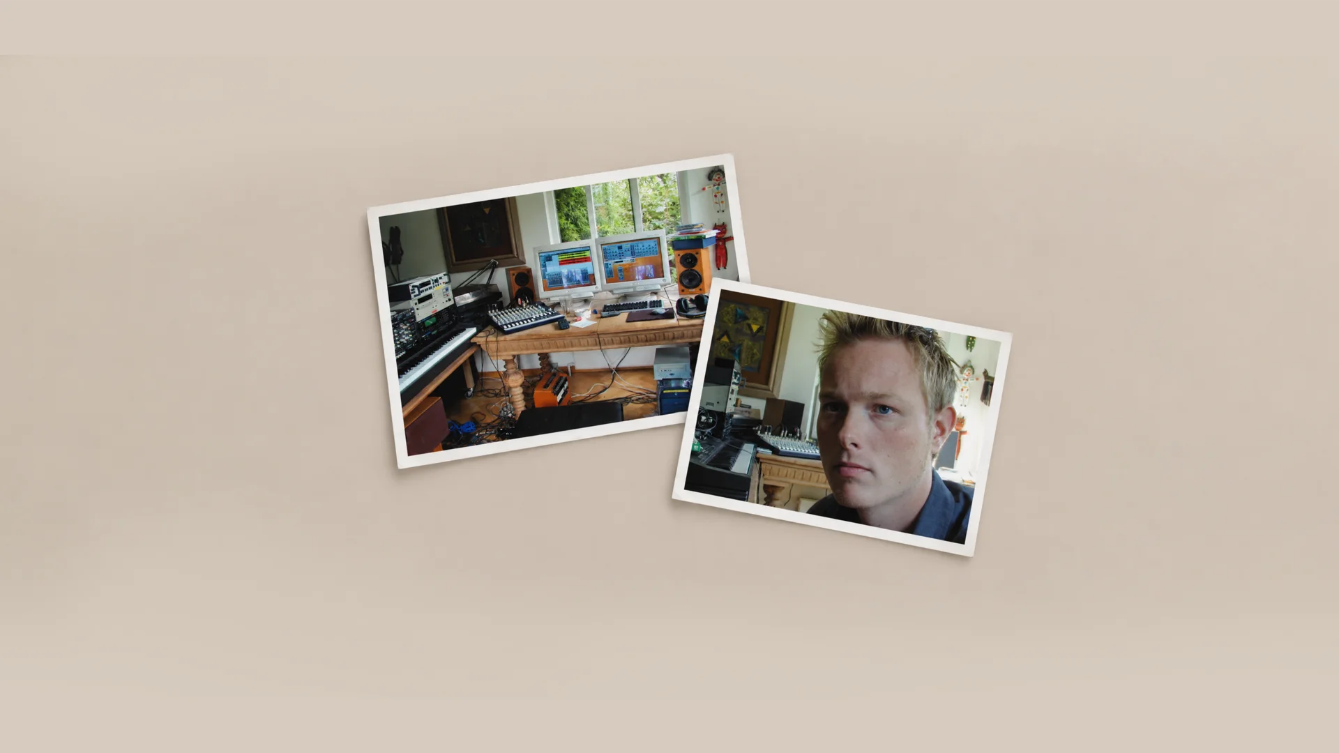
The company was founded under the name Audiotracking v/Paul Nybo Andersen – a name picked more or less at random. At the same time I co-founded Audio Management ApS with a few others, and when the CVR registration needed something written on it, it ended up being a word from the world I thought I would make a living in back then: delivering and producing sound as a freelancer.
But no business strategy is complete without a marketing strategy, and I quickly found out that the things I could build in a browser to attract customers were in greater demand than the things I could do in front of a DAW. The name was never changed. It is still there, a sort of receipt for where I was headed when I got the number.
I have primarily used my CVR number to sell services to advertising agencies and companies that possessed graphic and communicative skills in-house but lacked a web developer. That is the role that keeps recurring: being the one who could build what the others had drawn. In practice the number has followed me through my entire career, running alongside the permanent positions and partnerships I have held along the way – it is the continuity, the rest are chapters.
The number has also lent its name to a fair amount of unpaid work for non-profit organisations, including Ombold and Save the Children.
TL;DR:Co-founder of Audiomanagement, where we developed SoundIdentity® — sound branding and sound design for companies like Bang & Olufsen and branding expert Martin Lindstrøm.
Audiomanagement was created at Mylius Erichsens Allé 5, together with Birgitte Rode.
The first year, we made music products for school concepts. It took a while to get going, but on 1 November 2001 we founded my first private limited company in Roskilde. Our actual insight into sound identity came from Jesper Søefeldt at the then Kunde & Co., and from there we worked further with sound branding and sound design, based on the idea that every company should have a sonic identity, just as they have a visual one — including a collaboration with Bang & Olufsen.
We attended IBM's First Tuesday networking events and secured one million kroner in venture capital through them — not least thanks to a business plan written by Lars Vinggaard, a friend of Birgitte's who at the time held a senior position at PA Consulting Group.
Martin Lindstrøm
One of the projects where we put the method to use was for Martin Lindstrøm — the Danish branding expert who later became world-famous for books like Buyology and Brandwashed, and who in 2009 made Time Magazine's list of the world's 100 most influential people. Already back then, he was a major player in the industry, and we built a sound identity for one of his cases.
Birgitte Rode
Birgitte came from the music industry. She is a composer, songwriter, producer and musician, educated at the North Jutland Academy of Music and Aalborg University, and has worked over the years with concert production, theatre production and interactive visual art. She owns Kling Klang Studiet and Koncerthaven Marienhaab in Aalborg, and has released several albums with the bands Johnny og De Kolde Dæmoner and Walk The Walk. In 2016 she published the book "Soundbranding – The Connection Between Investment and Emotion", building on the same sound identity thinking we worked with at Audiomanagement.
SoundIdentity®
The core of the business was SoundIdentity® — our method for giving a company a sonic identity, in the same way a visual brand has a logo and colour guide. The process typically started with a thorough audit of the client's existing use of sound across all touchpoints, both internal and external.
The audit consisted of two steps. First, input from the client: brand personality, values, the emotional impressions and moods the company wanted to create or was already creating, plus a description of the existing sound and musical framework. Second, a written conclusion assessing whether the existing use of audio actually expressed the desired brand and created the desired engagement — along with a recommendation for what, if anything, should change.
My tasks
I was responsible for the digital side, and this is where I laid the foundation for much of what I know today — I learned both QuarkXPress and Cubase, two programmes I would otherwise never have had reason to pick up as a plain web developer. Birgitte brought the musical and sound-craft depth I lacked myself; I brought the ability to turn it into something a client could actually use — a website, a presentation, a tool.
A good brief makes the invisible decisions visible
"I assumed that was included."
That's a sentence I'd rather avoid in a web project. It can be about content, payment, data migration, or who makes sure the solution keeps working after launch.
The client reads "booking" and pictures reminders, cancellations and calendar integration. The developer has priced a form that sends an email. Both may have read the same brief and understood something different.
Two people can read the same brief and understand something different.
I use the brief to surface those differences while they're still easy to do something about.
The small words can hide a lot of work
"Login", "payment" and "integration" barely take up any space in a brief. But they can cover a great many decisions.
If users need to log in, who creates the account? Should employees and customers have different permissions? What happens when an employee leaves?
If the solution needs to pull data from an existing system, we need to know more than the system's name. What information should be transferred, how often, and who can grant access?
I'd rather spend time on those questions than on making the brief look polished. The answers affect what gets built, what it costs, and who ends up doing the work afterwards.
The client shouldn't have to write it all
I don't expect the client to choose a technical stack or draw up a data schema. The client contributes knowledge about the business: workflows, customers, employees, and the agreements the solution needs to support.
My job is to turn that knowledge into concrete requirements and explain the consequences of the choices we make.
The brief is therefore the starting point. We work out the more detailed project specification together. When a client describes who should be able to see which information, the team can turn that into access permissions. When a client explains a booking flow, we can describe the screens and actions that need to support it.
It's between the steps the gaps show up
A booking flow can look simple when everything goes as expected. The user picks a time, pays, and gets a confirmation.
But what happens if the payment fails, the slot gets taken in the meantime, or the customer wants to change their booking? Those situations are part of the experience. If we don't clarify them, the decisions get pushed onto development, or onto the staff who have to help the user afterwards.
The same goes for design references. I'd rather have three references with an explanation than ten links with none. Is it the calm, the navigation, or the way the service is explained that the client likes? The answer gives us something concrete to work from and judge the design against.
A small website needs a small brief
For a simple website, I'd gather purpose, content, visual direction and practical agreements into one short document. A project with payment, user roles and integrations typically needs more clarification.
I'd especially write down anything that can change price, timeline or responsibility. Who delivers the copy? Who migrates existing data? Who approves the solution, and who takes over operations?
An integration might, for example, be waiting on access to the client's system. That dependency needs to be visible before anyone promises a launch date.
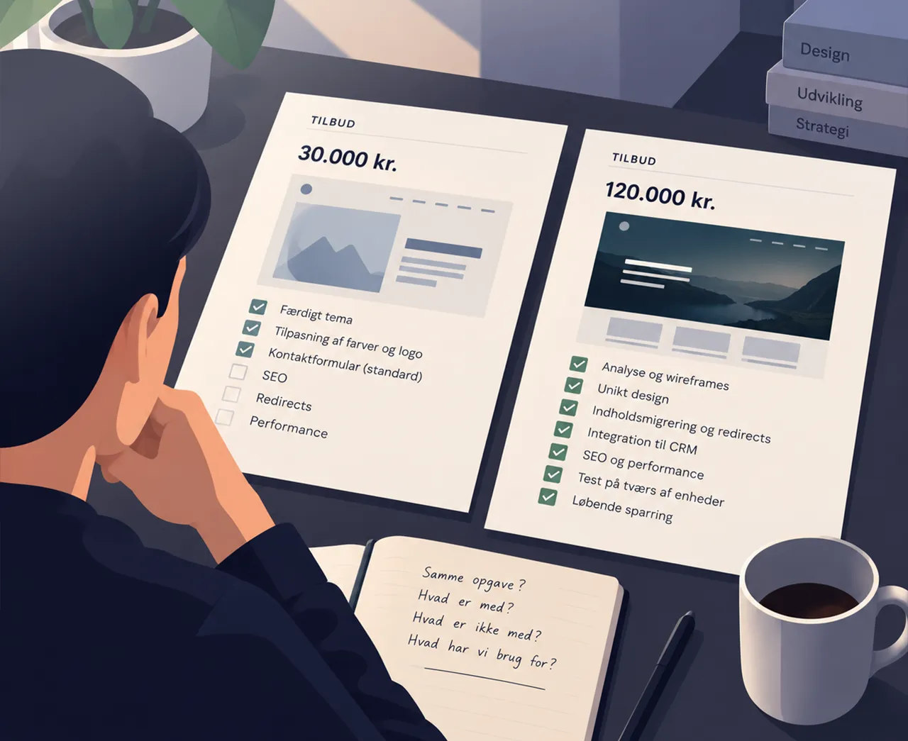
A better basis for choosing a supplier
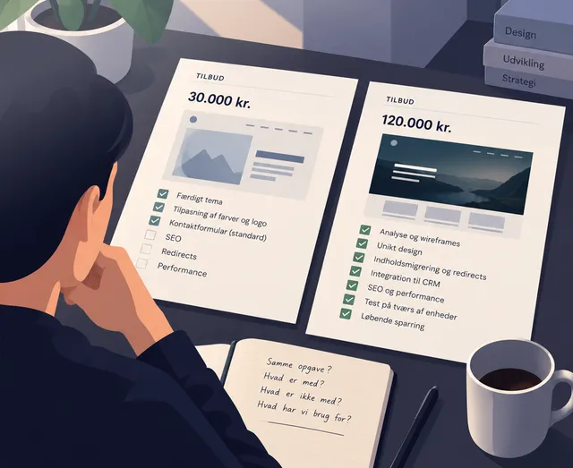
Two proposals can have different prices because the suppliers have priced different deliveries. Have both included content, integrations, testing and handover? What do they expect the client to handle themselves?
A low price often just means something has been left out — not that the job is smaller.
A well-prepared brief makes those differences easier to see. It also gives everyone a shared basis when new requests come up along the way.
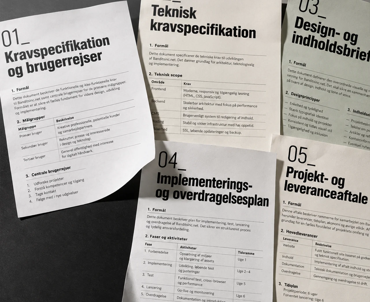
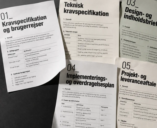
Through technical advisory, I can help get those questions answered before you request proposals. The documents below are one way to organise the decisions. On smaller projects, several of them can easily live together.
Reference: Five documents for a shared project foundation
01_Requirements specification and user journeysGathers goals, features, scope and the user's path through the solution, including errors and exceptions. Acceptance criteria for each feature describe what has to work before it can be signed off.
02_Technical requirements specificationCovers speed, security, integrations and technical stack. Also includes the data model, data storage, access permissions, and requirements for hosting, backup and operations.
03_Design and content briefGathers brand identity, colours, typography, key design elements and references together with content structure. Also clarifies responsibility for text, images and any translations.
04_Implementation and handover planGathers phases, responsibilities, dependencies and milestones from planning to launch. Describes migration of content and data, testing, and handover of access, instructions and operational responsibility.
05_Project and delivery agreementSets out scope, price, timeline, responsibility and how changes are handled. References the other documents and needs to be in place before delivery work begins. An initial discovery phase can be agreed separately.
Technical consulting
The number of documents matters less than whether the decisions are clear. I help get them clarified, so you have a concrete basis for choosing a supplier and moving forward with the project.
↑→Should we build AI into our product?2026-09Read more ↗
2026-09 · 6 min read_
Should we build AI into our product?
"We need some AI in there." That might be the right call. I'd start by figuring out which problem the technology is actually meant to solve.
AI has become markedly easier to build into digital products.
You no longer need a team of specialists to analyse documents, categorise text, generate content or let users search through large volumes of information. Many of these capabilities can be wired in through an API, and a prototype can often be built in relatively little time.
That opens the door to solutions that would have been expensive or unrealistic just a few years ago.
And it makes it tempting to start with the technology.
What are we trying to make better?
If a client asked me to build AI into an existing product, I'd start with the problem.
Do employees spend too long finding information? Does someone have to manually read and categorise hundreds of documents? Does support keep answering the same questions over and over? Is there a large amount of unstructured text that requires manual work?
Then we have something worth investigating.
It's the same approach I'd use for an app, a new CMS or an integration. First we need to understand the task. Only then can we choose the technology.
AI changes the range of what's possible. That order is the one I'd stick to.
AI can sit beneath the surface
The chat window has become the most visible image of AI. That's why so many ideas quickly end up as a text field where the user can "ask our AI".
Imagine instead a company with 20,000 documents. Employees spend time every day finding the right document, and then the relevant information inside it.
That's where AI could make the search better.
The user can still be met with an ordinary search field, a list of results and a few filters. Beneath the surface, AI can help understand the question, find relevant content or summarise the results.
The same applies to categorisation, handling enquiries, suggesting copy and a range of other tasks.
An AI feature can create real value without looking like AI at all.
What happens when it gets it wrong?
AI introduces a different kind of uncertainty than the one we normally work with in software.
Traditional code is typically deterministic. Given the same conditions, we expect the same result.
An AI model can produce something that looks convincingly correct, even when it's wrong.
That's why the consequence of a mistake matters at least as much as the model's accuracy.
If AI suggests a poor phrase for a product description, the user can edit it. If it miscategorises a document, the result can be presented as a suggestion awaiting approval.
If it instead forwards incorrect information to another system, or takes an action on the customer's behalf, the risk is a different one.
The same model can therefore be excellent for one task and unsuitable for another.
Maybe the AI should suggest – not decide
There's a real difference between:
"Here are the three documents I think are relevant."
and:
"Based on the documents, I've carried out this action."
In many products it makes sense to let the AI handle the time-consuming groundwork, and let a human make the final call.
The AI can read, sort, summarise and suggest. The employee checks the result.
If a task used to take 20 minutes and now takes two minutes to verify, that's already meaningful value created.
Full automation doesn't have to be the goal, then. The right boundary depends on the task, and on what happens when something goes wrong.
A flashy prototype is the easy part
One of the impressive things about current AI tools is how quickly you can get something working.
Take 50 documents, connect them to a model, build a simple interface. Before long, you can have a demo that answers questions about the material surprisingly well.
Then reality sets in.
What happens with 100,000 documents?
How fast does an answer need to arrive?
What does each call cost?
How do we measure quality?
What do we log?
How do we detect if the model starts producing worse results?
And what does the product do when the service behind the model is unavailable?
This is where a demo turns into software that has to work every day.
AI has made it very fast to prove that an idea can work. Making it stable, economically sound and operable is still part of product development.
What data should the model have access to?
An AI feature is rarely better than the material it has to work with.
If it's meant to answer questions about a company's documents, we need to decide which documents it's allowed to see, how they're made available, and who's allowed to ask about what.
There's a difference between public product descriptions and internal documents containing customer information.
That affects the architecture.
Where is the data processed? What gets stored? What information is sent to an external provider? How do we handle user permissions? And what happens when a document is edited or deleted in the original system?
AI can absolutely be part of sensitive, business-critical workflows. It just requires that data and access are treated as part of the solution from the start.
Some problems have a simpler solution
AI is particularly interesting when a task has previously been hard to describe with ordinary rules.
Understanding the meaning of a text, finding patterns across documents, or formulating an answer from unstructured information are good examples.
Other tasks are already very precise.
If a system needs to find all unpaid invoices from the last 30 days, a database query can deliver a fast, predictable answer.
If support spends time answering the same question repeatedly, the cause might also be that the answer is hard to find on the website. In that case, better structure or search may be more valuable than putting a chatbot on top.
What matters is which solution removes the problem with the least unnecessary complexity.
Start with the smallest useful task
I'd rarely start with the ambition of automating an entire process.
Find one narrow task.
Something people spend noticeable time on today. Something whose result can be evaluated. And ideally something where a mistake can be caught before it has serious consequences.
Build that part, and use real data.
If an employee normally spends ten minutes finding and summarising information from five documents, that's a fairly good starting point. If AI can help do it in two minutes with the same or better quality, we have something concrete to measure.
From there, we can decide whether the solution should grow.
It's cheaper to discover the limitations there than after building an entire AI platform around an idea.
So should we have AI?
Maybe.
I use AI myself every day, and the technology has already changed my own workflow. Tasks can be solved faster, more ideas can be tried, and things that used to require a lot of manual work can be automated in new ways.
That makes AI worth investigating.
But it doesn't change the order I'd work in.
Understand the problem.Find out what actually needs to get better.Try the smallest solution that can show whether the idea holds up.Then choose the technology that fits the task.
The question isn't whether we can build AI into the product.
We probably can.
The question is whether the product gets better for it.
Technical consulting
I help assess which problem an AI solution actually needs to solve, where it belongs in the architecture, and when a simpler solution is the right call.
←A good brief makes the invisible decisions visible2026-10Read more ↗↑→A good design doesn't start in Figma2026-09Read more ↗
2026-09 · 5 min read_
A good design doesn't start in Figma
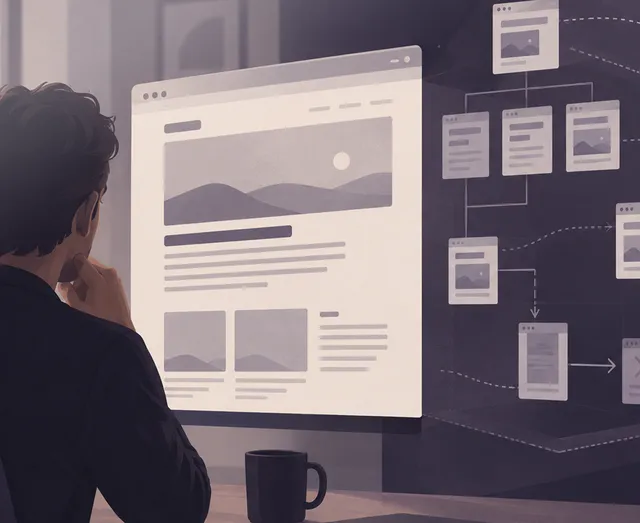
I can open Figma and start drawing a website right away. It's rarely a good idea. Because before I know what the page should look like, I want to know what it should get someone to do.
Who uses it? What are they there for? What do they need to find, understand or complete?
That's design work, even though nothing's been drawn yet.
What's the problem?
A design task often starts with a solution description:
We need a new homepage.
We need a configurator.
We need a dashboard.
That could well be right. But I'd like to take a step back first.
Why does the homepage need to change? What can't users find today? What should the configurator make easier? What decision should the dashboard help someone make?
Sometimes it turns out the solution is actually smaller than the task we started with.
If the problem is that customers can't find the prices, the solution might not be a redesign of the whole website. It might just be that the prices need to be easier to find.
That's a fairly important distinction when someone has to pay for the work afterwards.
The user and the business need to end up in the same place
I try to understand what the user is there for.
A customer might want to find out what something costs. Compare two products. Book an appointment. Understand a complicated service. Or just decide whether the company is relevant.
At the same time, the business has a goal.
It wants an enquiry, a sale, a signup, or maybe just to avoid the customer calling with a question the website should have answered.
The two things need to meet.
If you design only for the business's needs, you easily end up with a page full of messages the business wants to say.
If you only look at the user's immediate wants, you can end up with a solution that's pleasant to use but doesn't solve the task the business is paying for.
The design needs to bring those two needs together.
What should come first?
Once I roughly understand the task, structure starts to matter.
What information should the user meet first? What do they need to know before the next choice makes sense? What belongs together? What can be tucked away? And how many choices actually need to exist?
That's information architecture and user flow, but in practice it's mostly about order.
Imagine a form with 15 fields. You could spend a long time designing nice fields, good labels and exactly the right spacing between them.
But if seven of the fields aren't necessary, the best design decision might be to delete them.
Those are the decisions I'd rather make before I start discussing colours and corner radius.
That's why I like wireframes
At some point, the thinking obviously has to become visible.
I often use simple wireframes for that.
They're allowed to be boring.
A headline. A field. A button. A few grey boxes.
That makes it easier to talk about structure without also having to deal with images, typography and visual style.
Can you understand the page? Does the information come in the right order? Is the next step clear? Is anything missing? Can anything be removed?
It's cheaper to move a grey box than to change a finished solution.
Then comes Figma
Once the structure starts to hold together, it makes sense to work in more detail on the design.
Typography, colours, hierarchy, spacing, components, and the various states a user interface can be in.
This is also where reality needs to start pushing in.
What happens when the headline is twice as long as the one in the mockup? What does a form look like when something goes wrong? What happens on a phone? What if there are 17 search results instead of the three that fit so neatly into the design?
The finished solution rarely ends up containing exactly the content the designer used when it was drawn.
So it needs to hold up to a bit more than the presentation.
You discover a lot by handing it to someone else
When the project allows for it, I like to have others try the solution.
It doesn't have to be a big UX study.
You can get quite far by putting a prototype in front of someone who wasn't involved in making it, and giving them a concrete task:
Find the price.
Create a user.
Order the product.
Work out how to change your subscription.
And then not helping.
If you've worked on a solution yourself for weeks, you already know the answers. You know where the menu is. You know what the icon means. You know the button at the bottom of the page is the next step.
The user doesn't have that knowledge.
If you find the problem here, you can still change it before it becomes part of the finished solution.
The prototype doesn't always have to be in Figma either
Some ideas are easier to investigate in the medium they'll eventually work in.
If I want to feel out a flow, an interaction or responsive behaviour, I can therefore end up building a simple prototype in the browser instead.
I use Figma on many design projects – usually when I need to hand work over to others.
But by the time I open it, part of the design work should already be underway.
I want an idea of what problem we're trying to solve, who's going to use the solution, what they need to be able to do, and what the business needs to get out of it.
Then I can start drawing.
A good design doesn't start with what the solution should look like. It starts with understanding what it needs to solve.
Web design & UX
I design user interfaces from the first wireframes and prototypes to the finished design and design system – starting from what the user needs to be able to do, and what the business needs to get out of it.
←Should we build AI into our product?2026-09Read more ↗↑→What is technical SEO – and what isn't it?2026-08Read more ↗
2026-08 · 6 min read_
What is technical SEO – and what isn't it?
When a page isn't found on Google, it's tempting to start with the copy. But before I'd change the content, I'd make sure Google can actually find the page, read it, and understand which version should show up in the search result. That's a large part of what technical SEO is about - technical problems can stand in the way of even good content.
Technical SEO starts before the keywords
SEO is often lumped together with keywords, copy and links.
The technical part sits somewhere else. It's about things like how the website is built, which URLs it uses, what the search engine is allowed to visit, and how the pages connect to each other.
Can Google find the page?
Can it be crawled?
Is it allowed to be indexed?
Does the server return the right status code?
Does the page point to itself as the primary version, or does a canonical tag tell Google another URL is the one that matters?
Does the same content exist at five different addresses?
Those are questions a visitor rarely thinks about. But they're part of the technical foundation the search engine meets.
First the page has to be found. Then it can be indexed
Google can visit a page without including it in its index. And a page can exist on the website without being easy for Google to find.
So I wouldn't conclude much from the sentence:
"The page is on the website, though."
I'd look at things like internal links, the sitemap, robots.txt, meta robots, HTTP status codes and canonical tags.
And I'd look at what Google itself reports about the URL. In Google Search Console, URL Inspection can show details about Google's indexed version and test a live URL.
That's typically more useful than installing yet another SEO plugin and hoping a green indicator solves the problem.
Site architecture matters too
A search engine doesn't meet a website as a sitemap drawn on a wall. It moves through links between pages, among other things.
So structure matters.
If an important page can only be found through a search function, or sits buried five or six levels down without proper internal links, you've made the work harder.
The same goes the other way.
If almost every page links to everything, the structure says very little about what belongs together and what matters.
I therefore think of internal links as part of the website itself, not something sprinkled on afterwards for SEO's sake.
Navigation, categories, breadcrumbs and links within the content help both people and search engines understand how things connect.
Redirects are boring, until they're missing
When a website gets rebuilt, the URLs often change.
/about-us/ might become /the-company/.
The old page no longer exists, and the new one works fine. But Google may have known the old address for years. Other websites may link to it. Users may have bookmarked it.
If the old URL just disappears, those connections land on a 404 page.
So I normally map the existing URLs before a website gets replaced. The relevant old addresses can then be redirected to the new ones.
It's not the part of a new website anyone stands around admiring at launch.
But it's often the work you end up glad got done.
Canonicals need to point the right place
A website can have several URLs showing the same or nearly the same content.
That happens with filtering, parameters, categories and various technical ways of reaching the same page.
Here, a canonical tag can tell the search engine which URL you consider the primary one.
The problem comes when the system points the wrong way.
I've seen solutions where templates, plugins and custom code all had an opinion about metadata. The result can be that the page technically tells Google something different from what you assume.
So the mere presence of a canonical tag matters less than where it actually points.
What about speed and Core Web Vitals?
Performance and technical SEO overlap.
A slow website is bad for the user, so performance is also something I look at. PageSpeed Insights is a good place to start, since it shows measurements and points to specific areas worth investigating.
But I wouldn't start an SEO project with the goal:
We need 100 in Lighthouse.
A Lighthouse score can be useful for finding problems. It doesn't on its own tell you whether a website's technical SEO is good, and it doesn't tell you whether the content deserves a good ranking either.
Lighthouse is a diagnosis, not a grade.
If the page already feels fast for real users, there may be more important things to spend time on than moving a score from 96 to 100.
Structured data makes it possible to describe content in a format search engines can interpret programmatically.
That could be information about a company, a product, an article or an event.
Schema markup makes the most sense when it describes something that actually exists on the page, and the implementation is correct.
For that, Google's Rich Results Test can check the rich-result formats Google supports, while the Schema.org Validator can validate Schema.org markup more broadly.
The amount of markup says very little on its own. What matters is whether it describes the content correctly.
Hreflang, when there's more than one language
On websites with multiple languages or regional versions, hreflang comes into play.
It helps the search engine understand the relationship between, say, a Danish, Swedish and English version of the same content.
If a website only has content in one language, hreflang can be skipped.
That's a simple example of something I think matters in technical SEO: you don't need to implement a feature just because it's on an SEO checklist.
Part of the work is deciding what's actually relevant for the specific website.
So what isn't technical SEO?
Technical SEO can create good technical conditions for a page.
It can't make an irrelevant product relevant, create demand for something nobody searches for, or automatically turn a thin article into the best answer to a question.
If ten companies have technically solid websites and all want to rank for the same search, the search engine still has to choose between them.
That's where other parts of SEO come in: content, relevance, links, authority, and what the user is actually looking for.
So I'd be sceptical if a technical review was sold as a guaranteed route to specific rankings.
The technical side can remove obstacles.
It can't decide who ends up in first place.
I'd start by finding the problem
If someone tells me their SEO isn't working, I wouldn't start with a list of 50 things that could be optimised.
I'd first try to work out what "isn't working" actually means.
Is the whole website hard to find?
Is it individual pages?
Are the pages not indexed at all?
Did traffic disappear after a relaunch?
Have new URLs appeared?
Has the website gotten slower?
Or are the pages found and indexed just fine, but simply not ranking for the searches the company wants to be found on?
Those are different problems and need different solutions.
A website can have perfect redirects and still have poor content. It can have good copy and still block important pages from being indexed.
Technical SEO therefore isn't about optimising everything you can measure. It's about finding the technical things standing in the way — and leaving the rest alone.
Free tools for technical SEO
I use tools to find places worth investigating. They rarely say on their own what should be prioritised.
01_Google Search Consolemy natural starting point for indexing, sitemaps, search traffic and individual URLs. The Links report shows internal links and finds important pages getting too little internal attention.
02_PageSpeed Insightsfor performance, Core Web Vitals and specific performance problems on a given page.
03_Chrome DevToolsthe browser's own developer tools. I use Network, Elements and Console, among others, to inspect the HTML/DOM, JavaScript, redirects, response headers, resources and rendering.
04_Google Rich Results Testto check structured data against the rich-result formats Google supports.
05_Schema.org Validatorfor a broader check of Schema.org markup, including JSON-LD, Microdata and RDFa.
06_AI tool for internal linkinganalyses content across pages and suggests relevant links and anchor text. E.g. LinkStorm (English only) and LinkSigma.
A tool can point at a problem. It doesn't decide whether the problem is important enough to spend time solving.
Performance & SEO
I work with performance from measurement and diagnosis to images, caching, database queries, JavaScript and technical SEO. The goal isn't 100 in Lighthouse. The goal is a fast website that works well for real users.
←A good design doesn't start in Figma2026-09Read more ↗↑→What does a website cost?2026-08Read more ↗
2026-08 · 7 min read_
What does a website cost?
– and why are two quotes almost impossible to compare?
I've seen quotes for websites where one cost 30,000 DKK and the other 120,000. The obvious question is why one supplier is four times as expensive. The less obvious question is whether they even quoted for the same thing.
A website isn't a standard product. Two quotes can both list "design, development and launch" and still cover wildly different amounts of work.
So I'd be careful about just comparing the number at the bottom of the last page.
You have to first work out what you're actually buying.
So what does a website cost?
It depends on what's being built.
A website can be five pages with a contact form and opening hours. It can also have 2,000 products, three languages, login, CRM integration, payment, search and data from other systems.
Both can be called a website.
The price doesn't just depend on the number of pages. It depends on what needs to be designed, developed, integrated, migrated, tested and then run afterwards.
That's also why I'm sceptical of generic price lists with "small", "medium" and "large" website tiers.
They can give a rough sense of budget level. But they don't say much about the actual price until someone has understood the task.
30,000 or 120,000?
Imagine two quotes for the same new website.
The first comes in at 30,000 DKK.
The second at 120,000.
In the cheap quote, there's a ready-made theme adapted to the company's colours and logo. The customer migrates the content themselves. The contact form uses a standard solution. There's no particular review of SEO, redirects or performance.
The second quote starts with information architecture and wireframes. The design is built specifically for the company. Content and existing URLs are handled as part of the migration. The form is integrated with the CRM. It's tested on mobile and across browsers. Performance is reviewed before launch.
30,000 versus 120,000 now tells a slightly different story.
That doesn't mean the 120,000 quote is the right one. Maybe the company doesn't need all of that at all.
The important thing is spotting the difference before choosing a supplier.
What about websites for a few hundred dollars?
They exist too.
And I wouldn't dismiss them just because the price is low.
A cheap website can technically be perfectly fine. If the company needs five simple pages, a contact form and a design based on an existing template, there isn't necessarily any reason to make the project bigger.
What's interesting is rather how it can be done at that price.
Some suppliers have standardised the process heavily. They use proven templates and components, limit the number of pages and revision rounds, and can therefore build the same type of solution far faster than a project that starts with analysis, wireframes and an individual design.
Others split the payment differently.
The website can be cheap or even free to have built, while hosting, support, maintenance and changes are paid through an ongoing agreement. That model already exists on the market. There are solutions with monthly payment and a lock-in period, and solutions with no or a relatively short lock-in.
There's nothing inherently wrong with that.
You just have to compare the total agreement, not only the setup price.
What does the solution cost over three or five years? What's included in the ongoing payment? How long are you locked in? Who owns the domain, the design and the content? Can the website be moved to another supplier? And what happens to it if the agreement is cancelled?
A cheap website can therefore be exactly the right solution.
But a low price tells you just as little about what you're buying as a high one does.
What does "design and development" actually mean?
It can cover a surprising amount.
Design can be a few tweaks to an existing solution. It can also start with information architecture and wireframes and end with prototypes, responsive layouts and a component library in Figma.
"Development" is at least as broad.
Is it installation and configuration? Does functionality need to be built specifically for the company? Are integrations included? Who builds the forms? What about cookie consent, tracking, search, mail and user permissions?
Two suppliers can both write "design and development" on the quote and have priced something very different.
The more that's left to interpretation, the harder the prices are to compare.
The work you can't see
Part of the work never ends up as something you can point at on a screen.
On an existing website, the history comes on top of that.
A website that's existed for ten years contains ten years of decisions. Some of it should carry forward. Some can be removed. Some needs replacing. And some you only discover once you start examining the solution.
That work can take up very little space in one quote and quite a lot in another.
A redirect isn't particularly impressive at a status meeting. An old URL that returns a 404 after launch and loses traffic from Google is rather easier to notice.
Who's responsible afterwards?
Another difference often hides right after the word launch.
Who updates the CMS? Who takes backups? Who reacts if an integration stops working? Who owns the hosting account, the domain and the code?
Can another developer take over the solution?
And what does it cost when something needs to change in six months?
I'd want to know the answers to those before comparing the quotes.
A solution can be cheap to launch and expensive to own.
Standard or custom development?
This is where the price difference can get large.
If the problem is already well solved by WordPress, Shopify or an existing service, there's rarely much reason to build everything from scratch.
Conversely, a standard solution can get expensive if it has to be forced into doing something it wasn't built for. That's when plugins, workarounds and custom tweaks start piling up.
I have no principled preference for custom development over standard solutions.
I'd rather find the solution that solves the task without unnecessary complexity.
Sometimes that's a plugin. Sometimes it's custom code. And sometimes the feature shouldn't be built at all.
14 pages doesn't make the quote better
A long quote can look thorough.
But you can easily write 14 pages without having understood the problem.
I'd rather look at whether the supplier has understood the essential parts of the task.
What is the company trying to achieve? Who will use the solution? Who will edit it? Which systems does it need to talk to? What already exists? And what assumptions is the price built on?
That last one can move the price quite a lot.
If one supplier assumes the content can be exported automatically, while another has examined the system and found that half of it needs manual handling, their prices will naturally differ.
I'd compare the task before the price
If I had quotes for 30,000 and 120,000 DKK in front of me, I'd put them side by side and try to make them comparable.
What's included in both? What's only in one? What does the customer need to deliver themselves? What assumptions have been made? What's not included? And where's the biggest uncertainty?
Sometimes that review also leads to another question:
Do we even need a new website?
Maybe the existing solution can be cleaned up, redesigned or extended. If that solves the problem, I'd rather spend the money there than build something new just because the project started as a request for a new website.
The cheapest quote can easily be the right one
If the task can be solved properly for 30,000 DKK, there's no prize for spending 120,000.
If the cheap quote is missing work the company will need anyway, part of the bill has just been moved to later.
So I don't think the question "What does a website cost?" can be answered very meaningfully with a single number.
I'd start somewhere else:
What does the website need to do, what does it take to build it properly, and what needs to happen to it afterwards?
Once you know that, you can start comparing prices.
Where do the hours actually go?
For a typical business website, the work might break down like this:
01_Discovery & planningneeds, goals, scope, requirements and technical choices.4–10 hours
02_Information architecturepages, navigation and content structure.4–12 hours
03_UX & wireframesuser flows, functionality, wireframes and prototypes.8–20 hours
04_Visual designlayout, typography, colour, components and responsive versions.12–30 hours
05_Frontend developmentHTML, CSS, JavaScript, animation and components.20–50 hours
06_CMS & backendsetup, data models, administration and user permissions.12–30 hours
07_Custom developmentfunctionality and logic that doesn't exist off the shelf.4–30+ hours
08_IntegrationsCRM, ERP, PIM, payment, newsletter and APIs.4–30+ hours
09_Content & migrationcopy, images, documents and existing data.4–20+ hours
10_Forms & mailforms, notifications, spam protection and mail delivery.4–12 hours
11_Technical SEOmetadata, URL structure, redirects, canonicals and structured data.4–12 hours
12_Performanceimages, caching, scripts, database and Core Web Vitals.4–10 hours
13_Tracking & consentanalytics, tags and cookie consent.2–6 hours
Not every website needs every one of these tasks — a simple solution can skip several of them or solve them in a few hours, while integrations, migration or custom development alone can take significantly longer than the ranges above on other projects. So this isn't a price list, or a recipe for how long a website should take — it's an example of what can be hiding behind the two words "design and development" in a quote.
*Operations is typically ongoing, so the hours here mainly cover setup and preparation around launch.
Technical consulting
I help make sense of quotes, assess whether a solution should be built, redesigned or extended, and find the solution that matches the task without unnecessary complexity.
←What is technical SEO – and what isn't it?2026-08Read more ↗↑→Why is my website slow?2026-08Read more ↗
2026-08 · 6 min read_
Why is my website slow?
A slow website can be a 4 MB image. It can also be 10 other things. The first question isn't what the site is built in – it's where the time actually goes.
It can also be the server taking two seconds to respond. A script from an analytics tool. A plugin doing far too much work. A database query that should take 20 milliseconds but takes a second and a half.
Or a bit of everything.
So when someone tells me their website is slow, my first question usually isn't what it's built in.
I measure it.
Otherwise you risk spending half a day optimising images on a website where the actual problem is somewhere else entirely.
What does "slow" actually mean?
That's the first thing to work out.
Is it the first page that takes a long time to appear? Does the page show up quickly but feel sluggish when you click something? Does the content jump around while it loads? Is it only the product pages? Only on mobile? Only for users who aren't logged in?
Or does the whole site just feel heavy?
Those symptoms can have very different causes.
A slow server can mean the browser is sitting there waiting before it has anything to show at all. A large image can mean the page starts quickly but takes a long time to get the important content in place. Too much JavaScript can mean everything looks downloaded while the browser is still busy working through it.
That's why "slow" isn't precise enough to start optimising against.
But I use them as diagnostic tools, not as a verdict.
Among other things, I want to know how long the server takes to respond. Which files the browser fetches. How large they are. When the important content actually becomes visible. What's blocking the browser along the way. And what's happening for real users out there.
If the site has enough traffic, I prefer field data.
A lab test tells you what happened during one controlled run. Field data tells you what's actually happening on phones, computers and networks, out with real users.
The two don't always agree.
Images are still a classic
I still come across websites where an image is displayed at 600 pixels wide, but the browser is sent an original that's 4,000 pixels across.
That's rarely necessary.
Images need sensible dimensions, proper compression, and a format the browser can handle efficiently. And images further down the page usually don't need to be fetched before the user is close to them.
But image optimisation is also a good example of why you measure first.
If the images are already reasonably optimised, spending three hours squeezing another 30 KB out of them won't get you much.
There's no gain in thoroughly optimising the wrong problem.
JavaScript has a cost
The modern web can do an incredible amount.
Which also means we're sending an incredible amount of code down to the browser.
Analytics. Cookie consent. Chat. Tracking. Video. Ads. A/B tests. Form tools. Social media. Marketing automation.
Every single integration can be entirely legitimate on its own.
But the browser doesn't care about the org chart. It still has to fetch and run all of it.
So I'd often rather find out why a script is on the page than shave a few kilobytes off a CSS file. If nobody still knows why a third-party script is loading on every single page, that's worth looking into.
The fastest script is, after all, the one the browser never has to fetch.
Sometimes the problem is on the server
You can optimise the frontend as much as you like, but if the server takes a long time to assemble the page, you're already behind before anything is sent.
On a WordPress site, the cause might be plugins, heavy database queries, external API calls, or missing caching. On a custom-built solution, the problem might be a query pulling in far more data than necessary, or code doing the same work over and over. And sometimes the server is simply undersized or poorly configured.
Converting yet another image to WebP won't help much here.
You have to find the bottleneck.
Caching can make a huge difference
If a page is essentially the same for every visitor, there's rarely a good reason to rebuild it from scratch on every single visit.
That's the basic idea behind caching.
But caching exists in several layers. The browser can store files. A CDN can serve them closer to the user. The web server can cache whole pages or parts of them. The application can store results that would otherwise need recalculating. The database can avoid being asked the same question over and over.
That can make a very large difference.
But caching can also end up as a patch on a solution that's fundamentally doing too much work. If a database query takes three seconds, I want to know why – even if we cache the result afterwards.
Plugins aren't slow. Some plugins are.
On WordPress, the discussion quickly ends up at the number of plugins.
"We've got 37 plugins," the client will usually say. "Is that why the site is slow?"
Maybe.
But 37 doesn't tell me much on its own.
A small plugin might do one simple thing and barely register. Another might load scripts and styles on every page, make external calls, and run a handful of database queries on every visit.
So I want to know what those 37 plugins actually do before I start deleting them. The same goes for themes, frameworks and third-party solutions.
Mobile is often where reality shows up
A website can feel fast on the developer's MacBook with a fibre connection and still be slow for a large share of its users.
A phone doesn't necessarily have the same processing power. The connection isn't necessarily stable. And the browser might have plenty of other things going on at the same time.
"It loads fast for me," I hear now and then. That's not a particularly useful performance measurement.
It's also one of the reasons I prefer field data when there's enough of it. I'd rather know what users are actually experiencing than how fast the site is on my own computer.
Does everything need to be green?
No.
I like green numbers.
But I wouldn't spend hours moving a Lighthouse score from 98 to 100 if users already have a fast experience and that time could go somewhere more useful.
The same goes for Core Web Vitals. They're useful because they measure different parts of the user experience. But a website still has to work outside the measuring tool.
Lighthouse is a diagnosis, not a grade.
So what do you actually do about a slow website?
I wouldn't start by installing yet another performance plugin.
I'd start by finding out where the time is going.
If the server's response time is the problem, I look at the server, the application, the database and the caching. If it's the images, I work on size, format and delivery. If the browser is buried in JavaScript, I find out what's running, when it's running, and whether it needs to be there at all. If it's third-party scripts, sometimes you need to have the conversation about whether their value matches their cost. And if the problem only shows up on certain page types, that's where I start.
Measure first. Then optimise.
Performance work is obviously about technique. But a large part of it is about prioritisation. There will almost always be more you could optimise. The question is what actually makes a noticeable difference.
That's why I start with the measurement and work my way to the cause before I change anything. Otherwise you risk doing whatever's easiest to optimise, instead of whatever's actually making the website slow.
The fastest website isn't necessarily the one with the highest score. It's the one that feels fast to the people who actually have to use it.
Performance & SEO
I work with performance from measurement and diagnosis to images, caching, database queries, JavaScript and technical SEO. The goal isn't 100 in Lighthouse. The goal is a fast website that works well for real users.
←What does a website cost?2026-08Read more ↗↑→Which CMS should you choose?2026-06Read more ↗
2026-06 · 4 min read_
Which CMS should you choose?
WordPress, Umbraco, Drupal, Shopify, Webflow, or something else entirely? My slightly annoying answer is usually: What is it for?
A van is excellent if you need to move a fridge. It's less obvious if you need to drive Le Mans.
The same goes for CMSs.
Asking which CMS is best makes about as much sense as asking which vehicle is best.
Start with the job
I've worked with, among others, WordPress, Umbraco, Magento and Shopify, and taken over solutions built by other people. None of that has left me more convinced that one system is the right one.
Quite the opposite.
A system can be excellent and still be the wrong choice.
If the job is an ordinary corporate website with pages, articles, cases, staff and a few forms, WordPress can be a very pragmatic choice – see WordPress – in short for why.
If the business already works heavily with Microsoft and .NET, has its own developers, and needs more complex integrations, Umbraco can make more sense.
If the job is primarily about selling products, I wouldn't start with the CMS question at all. I'd start with e-commerce. Here Shopify can be the obvious choice, while Magento can make sense at a completely different scale and level of complexity.
If marketing needs to be able to build and change large parts of the site visually without constantly involving a developer, Webflow is worth a look.
And Drupal?
It can be a strong choice when the complexity actually calls for it. Many content types, permissions, workflows, multiple editorial groups and governance requirements can shift the calculation.
But I wouldn't choose Drupal because it can do more.
I'd choose it if the job requires what it can do more of.
Maybe you shouldn't have a CMS at all
This tends to get a little overlooked in the discussion.
When building a website, the CMS is often treated as a given. First we pick a CMS, then we figure out how everything else fits into it.
But maybe the product data already lives in a PIM. Customer data in a CRM. Prices in an ERP system. Users in an application. And maybe the content someone actually needs to edit amounts to ten pages and four text fields.
In that case, the question isn't necessarily which big CMS to install.
Maybe a small admin interface is enough. Maybe a headless CMS makes sense – I've written more about that trade-off in WordPress vs. headless. Maybe the CMS should only be one of several data sources.
And sometimes the best decision is to keep the system you already have. You don't have to replace technology just because newer technology exists – see also When should you change your CMS?
Who has to work in it on Monday morning?
That question is often more important than the feature list.
Because the technically best CMS can be a bad choice if the marketing department hates working in it.
And the most editor-friendly system can be a bad choice if developers have to fight the platform every time the business wants something slightly outside the standard.
So I'd look at the choice from at least three angles.
The user: what does the visitor actually need to be able to do?
The editor: who's going to create and maintain the content, and how technical are they?
The business and the developers: what integrations, features and changes does the solution need to accommodate over the next few years?
That last one matters.
You're not just choosing a CMS for the website you're launching on Friday. You're also choosing part of the foundation for changes you don't know about yet.
What does it actually cost?
The price list only tells part of the story.
An open-source CMS isn't free just because the licence is. And a system with a monthly subscription isn't necessarily expensive just because there's an amount on the invoice every month.
Development. Hosting. Updates. Plugins and extensions. Integrations. Security. Editors' time.
A CMS doesn't just cost what's on the invoice. It also costs time to develop, run and change.
Time for the editors, when something is awkward. And time for the next developer, who has to understand the decisions made along the way.
That's why a CMS with no licence can end up more expensive than one with a subscription. And a solution that's cheap to build can become expensive to own.
And then there's the dependency.
Can another developer take over? Can the data be exported? Is the business locked into a particular agency, a particular hosting platform, or a pile of custom code nobody fully understands the reason for any more?
The cheapest solution on launch day isn't necessarily the cheapest solution five years later.
What would I choose?
It depends on the job.
That's still the annoying answer.
I have no principled objection to WordPress, Umbraco, Drupal, Shopify, Webflow, Magento or headless. I also have no particular interest in using them if they don't solve the problem.
I'd first want to find out what the users need to be able to do. What the editors need to be able to do. Which systems the solution needs to talk to. Who's going to run it. And what the business realistically expects the solution to grow into.
Only then would I start looking at technology.
Because if someone recommends a particular CMS before asking about the content, the editors, the integrations and the business around it, I'd be a little sceptical.
You shouldn't go looking for a job for your CMS. You should go looking for a CMS for your job.
CMS solutions
Content systems built for the people working in them every day.
←Why is my website slow?2026-08Read more ↗↑→A visual identity has to work without the designer2026-05Read more ↗
2026-05 · 5 min read_
A visual identity has to work without the designer
A visual identity is easy to make look good on a screen. It gets harder when it has to go out into the real world – into a PowerPoint, onto an invoice, onto a sign someone edits themselves three years later.
A visual identity is easy to make look good on a computer screen.
It gets harder once it has to go out into the real world.
The logo has to go on the website. In a PowerPoint. On LinkedIn. In an email signature. On an invoice. Maybe on a sign, a van, a T-shirt, or something as mundane as a Word document someone edits themselves three years later.
And suddenly it's no longer the designer holding the file.
That's where you find out whether you've built a visual identity, or just a good-looking design.
It almost always starts with the nice version
When you're developing an identity, it's tempting to show it where it looks its best.
The logo sits with plenty of space around it. The typography lands perfectly. The colours are right. The photograph fits the composition. Nobody has written a headline twice as long as the one the designer used in the pitch.
You have to show the idea under decent conditions.
The problem starts if the identity only works under decent conditions.
Because reality rarely offers those.
A logo that looks fantastic at the top of a website can become unreadable as a profile picture on LinkedIn. A typeface that works fine on a Mac might not exist on the Windows machine where sales puts together a PowerPoint. A delicate colour that looks great on a calibrated screen can fall apart completely on an office printer.
And the graphic element tying the whole identity together in the brand guidelines can turn out to be nearly impossible to use in an email signature.
Those aren't the exceptions. That's the job.
An identity is a system
I've always struggled a little with the idea that a visual identity is, first and foremost, a logo.
The logo obviously matters. But it's only one of the components that make a business look like itself.
Typography. Colours. Image style. Spacing. Hierarchy. Shapes. Icons. The way a headline sits. How much is allowed to happen at once. And just as important: what you consistently choose not to do.
Together, they form a system.
A good system doesn't mean everything has to look the same.
It means things can look different and still clearly belong together.
An invoice doesn't need to look like the website. A LinkedIn ad shouldn't look like a business card. A presentation has different requirements than a sign.
But you should still be able to feel that the same sender is behind it.
And the system has to survive the situations the designer never planned for.
Does the headline still work at 73 characters? Is the logo still recognisable at 32 × 32 pixels? Can an external supplier understand the system without calling the designer?
That's often where it becomes clear whether the identity actually holds up.
The brand guidelines aren't the identity
I've built brand guidelines with rules for logo, colours, typography, image use and production.
They're useful.
But a set of brand guidelines can also end up as a very nice piece of documentation for a system nobody can actually use in practice.
It can state exactly how much space the logo needs around it. That doesn't help much if the person putting together the next presentation can't find the right logo file.
It can list six RGB, CMYK and Pantone values. That doesn't help if nobody has decided which colour to use as the default in PowerPoint.
It can include four different logo variants. That doesn't help if nobody can tell which one to use when.
An identity doesn't get stronger by having more rules. It gets stronger by having the right rules. And sometimes by having fewer.
When others have to take over
This, in practice, is where a lot of my work with visual identity actually happens.
Not just designing something that looks right, but making it possible for other people to use it afterwards.
That might be a developer who has to translate colours, typography and spacing into components and CSS. A marketing person putting together a post. A salesperson opening PowerPoint. A print shop that needs the right PDF. Or a business owner who, on a Friday afternoon, has to change the opening hours on a sign themselves.
Those people don't necessarily need to understand every graphic decision behind the identity.
The system has to help them make roughly the right choices anyway.
That's where design stops being a deliverable and starts being something the business can actually use.
When everyone can suddenly produce graphics
AI sharpens the problem.
I wrote in Is my job as a graphic designer under threat? about how AI makes the actual production of graphics cheaper. That also means far more people within a business can produce something themselves.
Marketing can generate an image. Sales can put together a presentation. The CEO can get AI to make an illustration. An external partner can generate an ad.
Each individual piece can look fairly professional in isolation.
And together, the business can start to look like five different businesses.
That doesn't make the need for a visual identity smaller. If anything, it becomes more important to be able to describe what makes the business look like itself.
Colours and fonts are part of it. But so are image style, composition, tone and contrast.
In the past, this kind of framework existed so others could keep working with the identity without the designer sitting next to them. Now the framework also has to work when someone sets AI loose to produce something.
The difference between two prompts gets bigger:
"Make a professional image for our LinkedIn post" – versus – "Make something that clearly looks like us."
The second one requires there to actually be an "us" to look like.
It has to survive being used
The real test of a visual identity doesn't necessarily come when it's presented.
It comes six months later.
When someone has put a presentation together without asking. When the developer has built the next feature on the website. When a new employee has started. When a document needs printing on the office printer five minutes before a meeting. When AI has generated an image for a post. When the logo suddenly has to appear on something nobody thought about when the identity was built.
If the business still looks like itself there, the identity has started to prove its worth.
Because a visual identity shouldn't only look right when it's being presented.
It has to hold up once the designer is no longer in the room.
Visual identity
Visual identity for companies that need to look like something you can rely on.
←Which CMS should you choose?2026-06Read more ↗↑→Is my job as a graphic designer under threat?2026-05Read more ↗
2026-05 · 10 min read_
Is my job as a graphic designer under threat?
AI-generated graphics have moved out of the computer and into the real world. The question is no longer whether AI can make graphics. It can. The question is what is then left of the graphic designer's work.
It really hit me this summer, while I was travelling.
On menus and A-boards outside restaurants, the same type of image kept turning up again and again. Burgers, pizzas, cocktails and durum kebabs with a look I've come to associate with AI-generated graphics.
You could still tell. AI apparently still can't quite manage to make a burger or a durum kebab that actually looks like something you'd want to eat.
But that's probably mostly a matter of time.
Since then I've started noticing it elsewhere too. In Facebook posts, ads and small businesses' marketing. Not necessarily because I can say for certain that something was made with AI, but because a recognisable aesthetic has started to emerge: glossy, over-obvious and slightly more advertisement-like than the sender probably intended.
The interesting part wasn't really whether the images were good or bad.
It was that I suddenly found myself looking at something a graphic designer, illustrator or photographer could previously have been paid to make.
And as a graphic designer, it's hard not to ask the question:
Am I looking at some of my own work?
Making something that looks good has become cheap
A few years ago, a small restaurant basically had three options if it needed an illustration for a menu or a sign.
It could make one itself. It could find some existing stock material. Or it could pay a graphic designer or illustrator to make one.
Now there's a fourth option.
You describe what you want, and shortly after you don't have one proposal, but ten or twenty. If you don't like the result, you try again.
If a small café with no meaningful marketing budget can now get an illustration made that makes its menu more inviting, I find it hard to argue it should have paid a graphic designer instead.
That would mostly be an argument for preserving my own work.
AI has removed a production barrier, and for a lot of people that's a genuine improvement.
But was it ever my job to begin with?
In the short term, I don't actually feel especially threatened.
Because the truth is that a lot of the AI-generated material I see would never have landed on my desk anyway.
The restaurant run by the local football club, putting together a new menu every week, would hardly have called a graphic designer every Thursday before. It simply wouldn't have been worth it.
Maybe they'd have tweaked an old Word document themselves. Maybe the old menu would just have stayed up another week.
Now they can put something new together in a few minutes.
In that case, AI hasn't taken over the graphic designer's work. AI has solved a task that previously wouldn't have been solved at all, because the cost-to-benefit ratio didn't make sense.
But that doesn't mean the market just gets bigger and nobody loses anything.
Once it becomes possible to get graphics made almost for free, it also changes expectations about what graphics ought to cost. A business that previously would have bundled its needs and paid a graphic designer for a larger job can now start solving parts of it itself.
And some of what starts out as work I'd never have gotten anyway can easily drift into territory I used to be paid for.
The line between new work created by AI and old work taken over by AI is therefore not especially sharp.
That's also why I don't feel especially threatened in the short term, even as I can clearly see where the trend is heading.
Some of my old work is under threat
If the brief is:
"Make a nice illustration of a burger we can put on our A-board."
then the need for me is smaller than it was five years ago.
The same goes for variations on an idea. Cutting out images. Extending a photograph. A quick illustration. Different visual directions. Material in several formats.
These are tasks that used to require a person with particular tools and skills, and that can now, in some cases, be solved in a few minutes.
When I was learning graphic work, the tools themselves were a significant part of the skill. You had to know Photoshop, Illustrator and InDesign.
But the craft was never only about operating the software.
It was also about understanding colour management, and knowing what happens when something moves from screen to print. Delivering files with the right colour profiles, cropping and bleed. Handling fonts correctly. Understanding resolution, image formats and different production methods.
And it was about discovering that the text on a sign can't actually be read from the distance it's meant to be seen at. That the contrast is too low. That the logo ends up too small. That the key message gets lost. That something that looks good on my screen doesn't necessarily work on an A-board, a phone, or in print.
In other words, a graphic designer doesn't just deliver a file. Part of the job is understanding where and how it needs to work.
A lot of that knowledge also functioned as a ticket to the work in the first place. Clients paid the graphic designer partly because the graphic designer could do something the client couldn't do themselves.
That ticket has gotten cheaper.
You no longer need to master all of it to produce something that looks professional at first glance.
But you still need a good part of it if the result also has to work once it leaves the screen.
And when far more people can suddenly produce their own graphics, another paradox appears: the results become more individual, while at the same time starting to look like each other.
So why does it still look like something I've seen before?
The possibilities have become close to endless. And yet there's a look that keeps recurring.
Saturated colours. Soft illustrations. Big smiles. Perfect products. Dramatic lighting. Very little randomness.
It all looks right, in a way. Maybe a little too right.
But that's not a new problem.
Stock photos gave us meeting rooms full of unusually happy people. WordPress themes made thousands of businesses end up with roughly the same website. Bootstrap made it possible to build a decent-looking interface without designing every element yourself. Canva made professional-looking layouts available to people who'd never opened InDesign.
AI is another step in that same direction.
The difference is that the result no longer has to be the same template or the same stock photo. Every image can be unique.
And yet they can still feel the same.
There's probably also a geographic bias in this.
A lot of the generative AI we use has been built by American companies for a global market. You can feel it in the aesthetics. The polished, colour-saturated, very explicit visual language often sits closer to international advertising aesthetics than to the more restrained Nordic design tradition I grew up with.
That doesn't mean AI can only produce American-style graphics. You can obviously ask for something else, and the models keep getting better at hitting particular styles, places and cultural references.
But the default suggestion still matters.
If millions of people suddenly get access to a tool that makes a large share of the visual decisions for them, that tool's idea of what "good" looks like also starts to shape the visual landscape around us.
In that sense, the model may be taking on something like the role the template used to have. The difference is just that the template is no longer visible. Two people can get two different images and still end up with something built on roughly the same aesthetic choices.
The result can be unique without necessarily being particularly original.
That's also part of the graphic designer's job that may be becoming more important. Not necessarily producing the alternative, but being able to see when the default doesn't fit. When the local restaurant suddenly looks like an American fast-food chain, or a Danish business ends up with a visual identity that could belong to anyone.
That doesn't necessarily require me to draw the illustration myself. But it does require someone to notice that it's wrong.
That observation also has an expiry date, of course.
The models are getting better at local references, and users are getting better at steering them. In a few years it may become far harder to even talk about a recognisable AI aesthetic.
But right now, I think it's there.
Graphics and graphic design aren't quite the same thing
This is maybe where the real difference lies – between producing and deciding.
AI has gotten very good at producing graphics. But producing something isn't the same as deciding what should be there – or how it should work once it meets reality.
Graphic design has never only been about being able to make what ends up on the page.
What should take up space? What should barely be visible? Who needs to understand it? Can it be read from the distance it's meant to be seen at? What typography suits the setting? Should the tone be humorous, exclusive, cheap, serious or almost invisible?
And maybe the most important question:
Should there even be an image at all?
That's the part of graphic work that's easy to overlook, because the result of a good decision is sometimes precisely that not very much gets made.
AI can help with the decisions too
It would be a bit too convenient to stop the argument there and say that AI produces while the human thinks.
Because AI is getting better at that last part too.
I can already use AI to discuss a layout, suggest directions, critique a composition, find alternatives and question my own choices. It's no longer just an image generator on the other end.
So I don't buy the reassuring version of the story either, where AI takes over the boring work while we humans keep all the creative parts.
The line isn't that neat.
If production has gotten cheaper, there's no particular reason to think judgement and decisions will forever remain ours alone.
From producing to choosing
I've experienced something similar in my work with code.
AI means I can produce more code, faster, than before. So I spend less of my time on the production itself and more on assessing what gets produced.
Is this the right solution? Does it fit with the rest? What's missing? What should be removed? What gets expensive in three years?
Something similar is starting to happen with graphics.
When it becomes cheap to produce ten proposals, it becomes more valuable to be able to see which one is the right one.
Or that all ten are wrong.
The experience doesn't disappear just because production gets easier. It just gets used somewhere else.
That doesn't necessarily move the graphic designer out of the process. It moves where in the process the graphic designer creates value.
A snapshot in time
There's a basic problem with writing an article like this one:
The conclusion has an expiry date.
What AI can do today isn't necessarily what it can do in a year. Some of the things I can point to today as the difference between generating an image and delivering graphic design work, it's going to get better at too.
The conclusion in that article is that, in the short term, AI doesn't change what I can do – but it changes how I work.
The point isn't that progress necessarily continues in a straight line, or that AI gets better at everything.
The point is that it's dangerous to build your professional identity on the things AI can't do yet.
A year ago, I could point to tasks in my work with code where AI wasn't especially useful. I use AI for some of those today. There's no particularly good reason to think graphics will be any different.
So my conclusions here can only be a snapshot in time.
If I reread this article in two years, there are probably things I currently consider a graphic designer's territory that AI will by then handle without much trouble.
So the interesting question isn't just where the line sits right now.
It's what happens when it moves.
So am I threatened as a graphic designer?
In the short term: not particularly.
Some of the AI-generated graphics I see around me don't represent lost work. They represent work that would never have been commissioned from a graphic designer to begin with.
But parts of my work are under threat.
So when I'm standing in front of that A-board wondering whether I'm looking at some of my own old work, the answer is both yes and no.
Some of the illustrations could have been jobs I'd once have been paid to make. Others only exist because they can now be produced so cheaply that someone decides it's worth doing.
And those two categories are probably going to blur together more and more. Once businesses discover they can solve small graphics tasks themselves, it doesn't necessarily stop at the tasks they'd never have bought in the first place.
Whether AI has, right now, made a burger with slightly odd-looking cheese, or a durum kebab nobody really wants to eat, is unlikely to be what saves the graphic design profession.
It's going to get better.
But there are still some questions left.
Does the image suit the restaurant? Does the place look like itself? Or is it just another unique illustration that still ends up looking like all the others? Can the sign be read from across the street? Does it tie together with the menu, the website and the rest of the experience? And should there have been an illustration there at all?
Once producing an image becomes almost free, the value shifts more towards being able to answer those questions. That's also the work I do myself in visual identity: not just producing the graphics, but deciding what they need to do, and whether they should even be there.
So maybe I'm less threatened as a graphic designer than I am challenged on what it actually means to be one.
←A visual identity has to work without the designer2026-05Read more ↗↑→When should you switch CMS?2026-04Read more ↗
2026-04 · 5 min read_
When should you switch CMS?
Most people ask the wrong question first. The interesting one is not which CMS is best – it is whether the CMS is even the problem.
The question "should we get a new CMS?" usually arrives before the diagnosis. Somebody has become frustrated – the editorial team, the developers, management – and the frustration gets translated into a platform question quickly, because that is the easiest thing to act on. A new CMS is a project with a start and an end. Working out what is actually wrong is harder, and it often gets skipped.
First: what actually hurts?
What people call "a CMS problem" is usually one of three different things, and each needs a different fix.
A maintenance problem. Old plugins, no updates, code nobody dares touch, no version control. That is not the platform's fault – it is eight years where nobody cleaned up. The fix is cleanup, not a new system.
An implementation problem. The platform is fine, but this particular build is not – a product structure that was never thought through, an integration glued together at the last minute, a content hierarchy that made sense for the first project and not for what the site has become since. The fix is rebuilding the part that is broken, not replacing the foundation.
A platform problem. This is the rarest of the three, and the strongest argument for a new CMS: the way the platform models data and handles workflows no longer fits what the business needs. Not because anyone implemented it badly – but because what the business needs to do does not fit the way the platform thinks about content. Sometimes the answer is not a different CMS, but a different architecture around the existing one – see WordPress vs. headless.
A platform problem can also be more fundamental: the system is no longer maintained or security-patched, and staying on it is no longer safe.
The three get mixed up constantly, and that is expensive. A maintenance problem fixed with a migration is money spent on the wrong thing – and a real platform problem met with yet another cleanup is time that just postpones the same conversation a year later.
When the CMS is not the problem
Most "we should switch CMS" conversations start here, without anyone noticing. Plugins that overlap because different developers solved the same problem twice over eight years. A theme nobody dares update. No version control, so nobody knows what has actually changed since last time. None of that is a sign the platform is wrong – it is a sign the system has never had the maintenance it needed. I wrote the full list in The art of inheriting a WordPress installation; I will not repeat it here.
When the CMS has actually become the problem
A real platform problem looks different. It shows up when the way the system organises content and data no longer fits what the business needs to do. If a new feature keeps requiring another exception, another layer, or the same information stored in more than one place, it is worth asking whether the problem can still be solved within the existing platform.
The technical side is only half the story. A system can work flawlessly on a technical level and still be wrong, if the editorial team has outgrown it. If an editor has to know internal IDs to fix a page, copy the same content into three different places, or call a developer to create a new content type, the problem is not necessarily performance or old code. It is a sign that the system's workflows no longer match the organisation using it every day. Whether that calls for a new CMS or a better implementation of the existing one is exactly what needs working out.
What actually gets better?
Before deciding on a migration, there should be a concrete answer to: once we are done, we will be able to ___, which we cannot today.
"We get a newer codebase" is not an answer that carries a project of that size. "The editorial team can manage several markets without developer help" is. "Product data gets one model instead of living in three different places in three different ways" is too. The difference is whether the answer points to something someone can concretely do afterwards – not whether the code looks nicer.
What you leave behind
"We'll just build it fresh" sounds simpler than it is. Underneath sits content, URLs, redirects, metadata, structured data, images and files, users, integrations, forms, tracking, consent, historical data, editorial workflows, permissions, and everything the search engines already know about the site.
But there is also something less visible than the list.
The old solution contains eight years of decisions.
Some of them are bad. Some of them solve problems nobody remembers existed – an exception for one client, a workaround for a system that no longer exists, a rule nobody can explain any more but that still solves a real problem. Do not move anything before you know why it is there.
A migration is a project of its own
A migration is not installing a different system and pouring the old content into it. The old system typically has to keep working while the new one is built, and changes to content and data do not stop in the meantime.
That is why a migration also needs a plan for the transition: what moves automatically, what has to be rebuilt, what has to be tested, and when the new system takes over. "We'll just move the content over" often turns out to be the smallest part of the work.
Fix it, or switch?
Not because the system is old. Not because the code is ugly. And not because a different CMS looks better in a demo.
Switch when the existing system is in the way of what the business or the editorial team needs to be able to do – and when it costs more to keep working around the limitations than it does to move.
If the problem is instead plugins, missing updates and code nobody dares touch any more, you may not need a new CMS.
You need to get a grip on what you already have. That is also the part of the work on CMS solutions I most often get called in for.
←Is my job as a graphic designer under threat?2026-05Read more ↗↑→WordPress — the short version2026-04Read more ↗
2026-04 · 3 min read_
WordPress — the short version
The thing that makes WordPress easy to extend is also the reason behind most of the problems you meet in older installations.
WordPress launched as a blogging platform in 2003 and has since grown into a CMS used for everything from simple websites to webshops, membership systems and larger content solutions.
WordPress is open source, so it can be used, modified and extended free of charge. There's also a very large ecosystem of themes and plugins, which makes it possible to add functionality without necessarily building everything from scratch.
Flexibility is the big strength
A basic WordPress installation is fairly simple. Functionality can then be extended as needed with plugins or custom code.
That can be anything from SEO, forms and multilingual content to payment solutions, membership management, integrations and full webshops with WooCommerce. WordPress can also be integrated with external systems and APIs, or used as a headless CMS with a separate frontend.
That flexibility means a solution can start simple and be extended later if the needs change.
Built to work with content
One of WordPress's strengths is the editorial side. Pages and posts can be created and edited without access to the code itself, and the Gutenberg block editor makes it possible to build content out of text, images and other blocks.
With a well-thought-out theme and a limited set of components, editors can work fairly freely with the content without also being able to break the design.
WordPress gives a decent starting point for technical SEO, but a good position in search results obviously doesn't come automatically from choosing WordPress. Content, performance, structure and the technical implementation still matter.
The flexibility is also the weakness
That same flexibility has a cost. Every extension adds one more part that has to work with everything else and be maintained over time.
A plugin can solve a specific problem in a few minutes. After a few years, the result can be 30, 40 or 50 plugins from different vendors, each updated at its own pace and possibly dependent on each other, the theme, or particular versions of PHP and WordPress.
That doesn't necessarily make the installation bad. But the more moving parts there are, the more there is to understand and maintain.
Updates and security
WordPress, themes and plugins are continuously updated with new features, bug fixes and security patches. That also means a WordPress installation isn't something you should build and then forget about.
Someone therefore needs to be responsible for hosting, backups, updates and security – whether that's the owner, a vendor, or the hosting provider.
The problem tends to show up when an installation can no longer be updated without risking that something breaks. One postponed update turns into several, and after a few years you can end up with a system nobody dares touch.
Custom work
WordPress can be customised a long way, but at some point, ready-made themes and plugins aren't necessarily the best solution.
Custom-built themes, custom blocks and integrations can produce a simpler solution, because the functionality can be built for the specific job instead of being bolted on through general-purpose plugins. In return, that requires development, and so a larger investment than installing a ready-made plugin.
So free isn't necessarily cheapest in the long run – and custom development isn't necessarily the right solution either. It depends on the job.
WordPress, or something else?
WordPress suits solutions where content needs to be manageable by editors, and where there's also a need for flexibility and the ability to extend the system later.
It's not necessarily the right choice for every project. A simple website might be better served by a hosted website builder, while highly specialised applications might be better served by a framework or a different CMS.
The choice should therefore start with the job – not with the platform.
In short
WordPress's biggest strength and biggest weakness are the same thing: flexibility.
It can be a clean CMS with a handful of custom-built components, or an installation with 50 plugins, three page builders and code from six different developers.
So the quality of a WordPress solution depends less on WordPress itself and more on how it's been built, extended and maintained over the years.
That's also the starting point for my work with CMS solutions: understanding what's already there before touching anything.
←When should you switch CMS?2026-04Read more ↗↑→WordPress vs. headless — the difference in practice2026-03Read more ↗
2026-03 · 6 min read_
WordPress vs. headless — the difference in practice
Headless gives you freedom by taking things apart. But whatever you take apart has to be put back together again.
If the answer is "we'd like Next.js because it's more modern," you haven't identified a business problem. You've identified a technology preference.
Headless usually gets sold as the modern choice – faster, more flexible, future-ready. That's rarely wrong in itself. It's just not the answer to what most questions about headless are actually about.
The interesting question isn't whether something can be done. It's what it costs to get it working properly.
What does headless actually mean?
In ordinary WordPress, editing and presentation are one system. The editor writes in wp-admin, the theme knows how it should look, and WordPress itself generates the page the browser sees.
Headless splits the two apart. WordPress becomes the place where content is created and managed, but not the system that builds the finished website. The content is delivered through an API to a separate frontend, often built in something like Next.js or Nuxt, which decides how it's displayed.
What do you already get with ordinary WordPress?
It's easy to cast traditional WordPress as the old-fashioned opponent headless is supposed to defeat. That's a poor starting point for the conversation, because WordPress has one architectural advantage bigger than most discussions give it credit for: it holds together.
The editor writes content. The theme knows how it should be displayed. WordPress generates the page. Preview is part of the same chain, because the theme handles both the public page and the view the editor is working against. Plugins can hook into the entire chain – from a field in the editor to something that actually shows up on the page.
That's not just simpler. It's less integration. There are fewer places where something can drift out of sync with something else.
Headless doesn't remove that connection. It turns the connection into something you have to define and maintain yourself.
When does the separation actually make sense?
Three patterns tend to recur when separating things actually makes sense.
The same content across multiple channels. An article, a product or a campaign needs to appear on the website, in an app, and maybe on a screen system in a shop – each with its own look. WordPress needs to deliver the content to all three, without itself deciding how it looks in any of them.
The frontend needs to be developed and deployed independently of the CMS. The frontend team works in a completely different stack from PHP and WordPress themes, with its own release rhythm, and doesn't want to be tied to how WordPress builds pages.
The CMS is one data source among several. The frontend doesn't just pull WordPress content – it assembles product data, user data, search results and CMS text from different systems. In that case, it's not natural for WordPress to also own the presentation layer.
That's headless as an architecture, not as "WordPress with a modern frontend."
What about performance?
Performance is often cited as the argument for headless, and it's worth being precise here, because the claim rarely holds up the way it's presented.
A well-configured WordPress site isn't slow because it's WordPress. With full-page caching, a reverse proxy and a CDN, a large share of traffic can be handled without PHP or the database ever being touched. And a heavy frontend built in React can easily end up slower for the visitor than a simple, well-cached WordPress theme. The architecture isn't a performance score on its own.
The real argument is a different one: the separation opens up different options for deployment, caching and scaling – not because headless is automatically faster, but because frontend and backend can be built, cached and scaled independently of each other.
What does the separation cost?
The frontend becomes its own software project. Not necessarily built from scratch – there are frameworks, component libraries and design systems to build on – but it has to be built, deployed and maintained as its own project, with its own infrastructure around it.
WordPress's plugin ecosystem doesn't necessarily hold up either. An ordinary plugin often adds functionality both in the backend and on the page itself. In a headless setup, the backend part can work fine while the frontend part becomes useless, because there's no WordPress theme for it to hook into. You can't simply assume that the ecosystem that makes WordPress fast to build with works the same way here.
And some of what the editor used to experience as one system becomes several things, each of which now has to work on its own and together: preview, navigation, forms, search, redirects, SEO fields. None of it disappears. But someone now has to make sure it works across the boundary between the CMS and the frontend, instead of it simply being how the system worked.
Security and vendor lock-in
Two other arguments come up often, and both deserve the same sober look as performance.
Security isn't a question of WordPress versus headless – it's a question of attack surface. The vast majority of WordPress vulnerabilities sit in plugins and themes, not in the core itself, which is updated continuously and quickly for security holes. A headless setup doesn't remove the plugin ecosystem, it just changes where it operates: the backend part of a plugin is still code that can have vulnerabilities, whether the frontend is a WordPress theme or Next.js. What headless actually gives you is a smaller public surface – wp-admin doesn't need to be reachable from the internet when the frontend doesn't depend on it at runtime.
Vendor lock-in isn't about whether you can switch CMS – you can with either architecture. The difference is what comes along with that switch. In ordinary WordPress, content, theme and presentation are woven together, so a CMS switch usually means the frontend has to be rebuilt too. With a headless frontend that already fetches its content through an API, the switch itself is smaller: the content layer can be swapped out without the frontend necessarily needing to be rebuilt from scratch – provided the new source can deliver data in a format the frontend already understands.
It doesn't have to be all or nothing
WordPress can, for example, deliver content through its API to an app, while the website itself keeps running on an ordinary WordPress theme. That's a hybrid solution: most of it stays as it was, and only the part that actually needs the separation gets it.
That can be a more pragmatic path than making the whole solution headless from day one. You get to use WordPress as a content source where it makes sense, without taking on the complexity across the entire site.
So when would I choose what?
Three questions are more useful than one.
Does the same content need to be used across several different products or channels? Does the frontend need to be developed and deployed independently of WordPress? Does the organisation have the development capacity to own two separate parts afterwards – not just to build them, but to run them?
If the answer is no to all three, there's rarely a good reason to split things apart. A yes isn't automatically an argument for headless either – but it's a concrete need you can start assessing the architecture against. If the answer is instead "we'd like Next.js because it's more modern," you haven't identified a business problem. You've identified a technology preference.
Headless gives you freedom by taking things apart. But whatever you take apart has to be put back together again – and that's the work that's easy to overlook when the decision gets made. It's also the part of the job I most often get called in for in my work with CMS solutions: understanding what actually holds a system together, before taking it apart.
TL:DR
WordPress holds together. Headless takes things apart.
That's an advantage if content needs to be used across multiple channels, the frontend needs to live its own life, or WordPress is only one of several data sources.
The price is more integration, more operations, and more parts that have to work together.
Headless isn't automatically faster or better. If you can't point to the specific problem the separation solves, there's rarely a reason to buy the complexity.
CMS solutions
Content systems built for the people working in them every day.
←WordPress — the short version2026-04Read more ↗↑→Sometimes I design in VS Code2026-02Read more ↗
2026-02 · 2 min read_
Sometimes I design in VS Code
Not because I have given up on Figma. But because sometimes it is faster to see whether an idea holds up in the browser than on a canvas.
When the idea is faster to build than to draw
There is a more practical side to the work I do. When I have an idea about how something should work, it can sometimes be just as fast and intuitive for me to write HTML, CSS and JavaScript as it is to work my way to it in Figma.
I write the structure, give it some styling, add a couple of interactions and see whether the idea holds up. Not as finished development, but as a prototype that already sits close to reality.
It has become even more obvious with AI tools like Claude Code and modern front-end frameworks. Setup, boilerplate and the fifth variant of the same button go faster, leaving more time for what actually needs a decision.
Two kinds of feedback
It gives a different kind of feedback.
In Figma I can see whether something looks right. In the browser I can see whether it works.
That is not the same thing. A static design cannot show me whether a flow actually holds together once I click through it myself, or whether an animation that looked right in my head actually feels wrong once it runs.
And sometimes that is the only place I discover that the solution I had pictured is not as good as it looked on screen.
That is part of what I like about being able to do both. I do not have to wait for someone else to build the idea before I find out whether it holds up.
Not a break with Figma
That does not mean I always start in code. Quite the opposite.
Figma is still the right tool for many of the early decisions. When flows need exploring, information architecture needs settling, or different approaches need comparing, it is far faster to be able to move things around without having to build them first.
But I no longer hold a fixed idea that design has to be finished before development begins. For me the two can be part of the same process.
A sketch can turn into code. The code can change the sketch. And sometimes the fastest place to find out whether an idea holds up is not the design tool, but the browser.
That is also the experience I bring into web design and UX and web development: a design thought through with buildability in mind, and code that respects the thinking the design has already shaped.
←WordPress vs. headless — the difference in practice2026-03Read more ↗↑→The most expensive code is the code you never had to write2026-01Read more ↗
2026-01 · 4 min read_
The most expensive code is the code you never had to write
Not all expensive code is bad code. Some of the most expensive decisions I have been part of were well-written solutions to problems nobody had yet.
26 years in the trade, and especially the years with Lifeguard, taught me how easy it is to mistake product development for value creation. When you can build something, it is tempting to build it. A new feature solves a problem. An integration opens a possibility. A more flexible architecture future-proofs the product. The problem shows up when you build a solution to a need you have not yet proven.
What cost before we knew what it was worth
The white-label architecture behind Vitalityguard is the clearest example. It was expensive in the week it was decided, with no guarantee anyone would ever need to swap the identity on top of the platform. It turned out to be the reason we could sell the same platform on under a different name six weeks after founding it.
The D-mærket seal is another. We were among the very first companies to go through the full process and become D-mærket certified - the Danish labelling scheme for IT security and responsible data use. It was a heavy process that ran over a year. At the time it was hard to see what the investment would concretely give us. It later turned out to open doors we would not otherwise have had access to.
Neither was the wrong decision. Both were expensive before they were worth anything, and that is the kind of investment you cannot know pays off - you can only know that none of them do if you never make them.
But that is not the same as building ahead
The other day I sat in on a class at EK - Copenhagen Business Academy at the Guldbergsgade campus. A former colleague now teaches database design there, and I was there to watch him teach - to form an impression, not to say anything. But he asked me to add to it as we went. What I told the students was that building a database is not only about solving the needs a client has now, but also the ones that arrive over time, that the client does not yet know they have.
That sounds like the opposite of the point above. It is not - but it is the other half of the same decision, and it is easy to forget once you have been burned by the expensive version of it.
The zone system in Lifeguard is the example - userspaces, as we called it internally. A user could hold one of several roles - from ordinary user to coach to the company's own administrator - and belonged to one or more teams, which in turn sat under a company. That was more granularity than any single client relationship required at the time. When Vitalityguard later had to give Danica access to users' data, we could not simply hand it over - not legally, and not in practice. The solution was a new userspace for Danica - not a new construction, but another layer on top of the structure that was already there. That is why we could solve it in three weeks: they could see what the user had given permission to share about themselves, the user could revoke that permission at any time, and all data processing stayed inside our own system. We never gave the data away. Had access and visibility not already been separated in the model, it would have been a rebuild, not an addition.
The difference is not whether you build ahead
It is what you build ahead for. The zone system was a structural choice: a data model that kept roles, teams and visibility separate, without knowing exactly which combination would be needed. We did not foresee Danica. We just built something that could hold an unknown need without being rebuilt. It costs something to build flexibility in from the start. But it can cost far more to discover afterwards that the structure cannot hold the need.
The white-label architecture was the same kind of choice - structure, not feature. What is expensive is something else: building features, integrations and options on a guess about what someone will use them for. That is not foresight. It is building what increases the options before you have built what reduces the uncertainty.
So the point is not build less. It is: build the structure that can hold what you do not yet know - and wait on the rest until someone actually asks for it.
Where code turns into economics
As a developer you ask whether something can be built. As the person responsible you also have to ask why it needs building now. That is the difference between code that solves a problem and code that just opens up a possibility.
I wrote about the economic side of this in After a bankruptcy: a technical decision is also a financial decision. This is the other side of the same experience.
It is also what I spend my time on in technical advisory: asking why before asking how.
←Sometimes I design in VS Code2026-02Read more ↗↑→From coder to reviewer – how AI changed the workflow2025-12Read more ↗
2025-12 · 4 min read_
From coder to reviewer – how AI changed the workflow
In the short term, AI does not change what I know – it changes my workflow.
“AI will never be worse than it is right now.”
Lars Nielsen, friend and former business partner
That line stayed with me.
Not as a defence of AI, but because it moves the question. The argument about whether the tool is good enough has an expiry date. The question of what you do yourself once it is does not.
What actually changed
I have been coding professionally since 1998. For most of that time the work was writing the code – sitting with the problem, finding the way through and writing the lines myself. It is still a large part of my work. But not in the same way as before.
I still write code, but a larger part of the day goes to stating the task precisely, assessing what comes back, and rejecting what does not hold. It looks less and less like one developer in front of an editor, and more like a developer who is also running a very fast, very literal and rather unreliable small team.
It reminds me of sitting at Lifeguard briefing my developers – writing the tasks into Trello, explaining what needed building, and reviewing what came back. The working day now feels closer to that role than to the one I had ten years earlier.
Why it takes more experience, not less
The common assumption is that the tool makes experience worth less. My experience is the opposite. A model can write something that looks convincingly right even when it is not – and the difference is not necessarily visible on a first read.
Seeing that difference requires knowing what to look for:
The query that works on ten rows and falls over at a hundred thousand.
The error handling that looks complete but never covers the path that matters.
The library that solves the problem and drags in thirty times more than needed.
That does not come from knowing how to prompt. It comes from having seen systems work, fail and be maintained long enough to recognise the problems before they get expensive.
That judgement has not become less important. It takes up more of the work than ever.
What I hold on to
I do not let anything ship that I have not read. Not on principle, but because I answer for it. When a client calls in eighteen months because something has broken, it is not a tool that has to explain why it was built that way.
And there are still tasks where I open the editor and write it myself, because that is faster than describing it. That is not nostalgia. It is the right call more often than the debate suggests.
Will there be developers in the future?
I have asked myself that often. I think there will be.
But I think a great deal more is going to get built. Things that used to be too expensive to build can now be done in a fraction of the time. And when the price falls, people do not necessarily stop buying. They also start buying what they previously had to go without.
There will still be demand for solutions that are not generic, and for design somebody has actually thought about. That does not become worth less because the trivial gets cheaper.
What worries me more is the way in. The routine work – the tasks you learned the craft on – is being taken over. That was where you built the experience that later lets you see when a suggestion does not hold up.
I do not know where that experience is meant to come from now. I have no good answer to that.
Nor do I know how much of the code I work with in five years I will have written myself from the first character.
But that is no longer the interesting question either.
I still have to understand the problem. I still have to see when the solution is wrong. And when the client calls eighteen months later, the responsibility is still mine.
I am still the developer. I just spend more of the day reviewing a colleague who writes extremely fast, never gets tired, and is occasionally completely wrong.
It is also the experience that goes into web development: being able to tell whether something works, regardless of who or what wrote it first.
Lars Nielsen, who set the thought going, regularly publishes on AI on LinkedIn and on YouTube.
←The most expensive code is the code you never had to write2026-01Read more ↗↑→The art of inheriting a WordPress installation2025-11Read more ↗
2025-11 · 6 min read_
The art of inheriting a WordPress installation
8 years, 34 plugins and a theme nobody dares touch. The job does not start by fixing anything – it starts by working out what is in use.
The job rarely arrives as a project. It arrives as “our site has got slow”, or “we cannot update anything without something breaking”. Behind it sits a WordPress installation that has been running for eight years, and that nobody has had a full picture of since the developer who built it moved on.
It is one of the more common jobs in the WordPress world. It just gets described rarely, because it is not a new site with a before-and-after picture.
The first step is not to fix anything
The temptation is to get going: deactivate plugins, update the core, clean up the theme. That is also the fastest route to switching off something that turns out to matter.
The first step is working out what is actually in use. Which plugins do something the site actually shows. What page types exist, and who edits them. What happens on an order, a sign-up, a form – the whole way from click to email or database. It usually takes a day or two, and it is the best-spent time in the whole job.
The rule I work by is simple: do not touch anything until you know why it is there. Code that looks redundant is often somebody's solution to a problem documented nowhere.
What you usually find
Some patterns recur.
Plugins that overlap. Two caching plugins installed by two different developers. A gallery solution used on a single page nobody has visited in two years.
Plugins emitting competing metadata. The worst kind of overlap, because nothing visible goes wrong. Two SEO plugins each write their own title, their own canonical and their own Open Graph tags into the same document head, and the theme may add a third set on top. The page looks right in a browser – but Google gets contradictory signals about what the page is called and which URL is the real one. It is not one broken plugin. It is two working ones.
Changes made in the theme rather than a child theme. Which means the theme cannot be updated without losing them – and so it has not been updated. From there it spreads: with the theme standing still, nobody dares update WordPress or PHP either, and eventually the whole installation is held in place by something nobody can remember.
Tracking that runs around the consent. Google Tag Manager installed through one plugin while consent is handled by another. Separately they both work: the banner appears and stores the choice, and GTM loads its tags. They do not necessarily know about each other, so the visitor's choice in the banner is not turned into the behaviour you assume. It is the kind of thing you do not find by using the site normally, only by looking at what the browser actually sends.
Code nobody dares touch. A functions.php of 1,000 lines, most of it added by different people over several years. No comments, no history, because it was never in git.
What I do about it
The order matters more than the tools.
A copy and version control. The installation has to live somewhere you can try things without touching what the client is using. And the code has to go into Git – not to be modern, but because it is the difference between “we changed something and now it does not work” and “we can see exactly what happened”.
What hurts now. If the site is slow, I measure why before optimising. If a security update has been deferred for two years, that matters more than tidying. The client should feel a difference before anyone starts on the work that cannot be seen.
One thing at a time. One plugin removed, the site tested, on to the next. It takes longer than clearing everything in one pass, but when something breaks you know what it was.
What makes next time easier. A child theme, so the theme can be updated. Changes moved out of functions.php to somewhere they can be read. A short note on what is where.
When it is not worth it
Sometimes the answer is to build new. It is when the theme is so far gone that clearing it up costs more than a new frontend, or when the content structure does not fit what the site has to do today. If it is the frontend that is the problem, that is not automatically an argument for leaving WordPress as the CMS – see WordPress vs. headless.
But that is rarer than people think – and it is worth noting that whoever would build the new one is rarely the most objective judge of it. A site with eight years of content, indexing and inbound links has a value that does not appear in the codebase.
What it is really about
An inherited installation is rarely only a technical problem. It is also a question of somebody being able to answer what happens, and why.
That is what the work is: turning a system nobody understands into a system somebody can run. The code gets better along the way, but that is not the point. The point is that the next time something has to change, it is a task and not a risk.
It is the same approach I bring to WordPress and CMS: understand what is already there before anything gets touched.
What I meet most often
An inherited installation rarely has all of them, and few are serious on their own. It is the combination that makes a job hard to estimate.
01_Plugin debt30-60 plugins, several solving nearly the same problem, some abandoned, and nobody sure any more which are needed.
02_Plugin conflictsTwo plugins hooking the same place, loading different versions of a library, or changing the same behaviour.
03_Update anxietyWordPress, PHP, theme or plugins cannot be updated, because nobody knows what breaks.
04_Bought themes and page buildersElementor, Divi, WPBakery and the like can, after a few years, leave a site that is hard to change without working against the system.
05_PerformancePlugins and themes loading CSS and JavaScript on every page, including where it is unused. Plus heavy images, expensive queries and missing caching.
06_Database cleanupwp_options, autoloaded options, revisions, transients and tables from plugins deleted long ago.
07_WP-CronConvenient until jobs get heavy, fail quietly, or need to run reliably at a particular time.
08_SecurityOld plugins and themes, permissions that are too broad, XML-RPC, file uploads, unprotected endpoints, and enough administrators to field a football team.
09_Custom code in the wrong placesChanges made directly in the parent theme or in a plugin, snippets in functions.php - and the classic small fix in core.
10_No version controlChanges made straight onto production through wp-admin or FTP, and no reliable way to see what changed since last time.
11_Staging and productionDatabase content has to go one way, code the other, while uploads and editorial changes had better not be overwritten.
12_URLs in the databaseSerialised data and absolute URLs make an ordinary search and replace more interesting than it ought to be.
13_Mailwp_mail() can return success without the mail reaching the recipient's inbox. SMTP or a mail service, SPF, DKIM and DMARC suddenly become part of the WordPress job.
14_REST API and integrationsAuthentication, rate limits, webhooks, retries, and external systems that do not behave the way the documentation promised.
15_WooCommerceA category of its own: checkout, hooks, order statuses, payment gateways, VAT, shipping, mail, and plugins on top of plugins.
16_MultilingualWPML or Polylang, hreflang, translated slugs, canonicals, and content that does not exist in every language.
17_Technical SEORedirects, canonicals, sitemap, robots, structured data - and several SEO plugins all wanting to own the contents of <head>.
18_Tracking and consentTag Manager, GA4, Google Ads, Consent Mode and cookie consent. Typically where you find that three plugins and the theme all insert tracking.
19_Gutenberg and blocksGood when it has been thought through. Less good when the editor gets 80 blocks and the means to break the design system.
20_Roles and permissionsEditors should be able to change this but not that - quickly more complicated than WordPress default roles reach.
21_The media library12,000 images, 14 generated sizes of each and 40 GB of thumbnails, with nobody knowing which ones the theme uses.
The list is not an accusation against WordPress. It is what happens to systems many people have touched over eight years.
CMS solutions
Content systems built for the people working in them every day.
←From coder to reviewer – how AI changed the workflow2025-12Read more ↗↑→Ctrl, Cmd and C#2025-08Read more ↗
2025-08 · 4 min read_
Ctrl, Cmd and C#
A language is learnable. It is the domain and the codebase that take time – and two machines that cost more attention than the syntax.
After some twenty years with PHP as the language I thought in, I moved partly over to C#. Partly, because it depended on the project: Egon and ebillet ran on Umbraco and required .NET, while the rest of the clients stayed on my usual stack.
Syntax you can read your way into. Types, classes, inheritance, interfaces – the same concepts I have used all along, with different keywords in front of them. A week in, I could solve real tasks in C#.
What actually took time
The domain. What the business actually does, why the numbers are calculated in precisely that way, which rules are written down nowhere because everyone in the office knows them.
And the codebase. Not the language, but this system's version of it: why there are two layers that appear to do the same thing, which one is the new one, and what the old one is still used for. That is learned by reading and asking, not by looking things up.
The platform was Umbraco, not just C#
The structure was recognisable. Helpers, middleware, models, views and services all had parallels to the world I knew from Laravel. I had to learn a new implementation, not a new way of thinking about web applications.
And to be honest, my work fortunately sat mainly in the view layer and in assets – where the distance between the two worlds is smallest. I did not move to .NET across the board; I worked in the end of it where my experience carried over most.
What I had to get used to was having to start the project in order to see it. Behind the little green play button in Visual Studio sit four things:
Starts IIS Express.
Publishes the project to it.
Attaches the debugger.
Opens the browser.
In PHP you save the file and hit refresh – the web server is already running, and there is nothing to publish.
It changes the rhythm of a working day. You stop fixing one thing and looking, and batch several changes instead, because each round costs a startup. In return you have a debugger attached from the first second, which is not nothing.
Two machines
The .NET work happened on a PC in Visual Studio Professional – not VS Code, which I use for everything else, but the full IDE. Whenever design elements were needed, or when the day brought one of the clients still on PHP, I moved back to my Mac. The tools and the workflow live there, and that is faster than rebuilding the same setup on the other machine.
Practically it was solved. The mouse and keyboard could switch between the machines at one press, and both machines used the same monitor. The hardware was not the problem. What did not switch was my hands.
The files did not follow on their own either. Graphics moved between the machines through OneDrive, which was already attached to the project – low-tech rather than elegant, but it worked, and nobody had asked for anything better.
The keyboard shortcuts sit in different places. Copy, paste, switch window, jump to the start of a line – after twenty years they are in the fingers, and one press of that button puts them in the wrong place. Worst are < and >: on a Danish layout they sit in one place on the Mac and another on the PC. Writing markup or generics you reach for them constantly, and the fingers go to the wrong place just as constantly. You do not rewrite anything; you just hit the wrong key and notice a second later. Each time costs nothing. A hundred times a day does.
Several times a day, for months. That is the kind of thing that appears in no account of what changing language costs.
What I took with me
After twenty years with PHP, it was interesting to discover how little of the experience was actually tied to PHP.
Reading unfamiliar code, finding the patterns in a system, asking the right questions about a requirement, and knowing when something is likely to become a problem later – that all came along. It is the part of web development that has nothing to do with the language, and everything to do with understanding what is already built.
C# had to be learned. Of course. But it turned out to be the least interesting part of the change.
The hard part was getting to know one more codebase, one more domain and one more platform.
And remembering whether copy was under Ctrl or Cmd.
←The art of inheriting a WordPress installation2025-11Read more ↗↑→After a bankruptcy2025-02Read more ↗
2025-02 · 7 min read_
After a bankruptcy
Valued at 35 million at its height, bankrupt in December 2023, a new company seven months later. This is what sat in between – and what I took with me.
In December 2023 Lifeguard Health was declared bankrupt. We had run for seven years, employed 40+ people along the way, had Maersk as a client, a joint venture with Dansk Sundhedssikring and investors behind us. At its height the company was valued at 35 million kroner. Then covid came, and we never found our way back.
The last months went on keeping it alive while we waited for the client who was meant to save it. The client pulled out at the 11th hour. There was no plan B, and there rarely is at that point - you have spent everything you had on getting there.
On a CV that reads as a smooth transition. It was not.
It takes longer than the accounts say
A bankruptcy has a date. The administrator sends a letter, the company ceases, and a year appears in the company register. All of that is over in a few weeks.
What takes time is something else. A company you have built over seven years sits in your head as a collection of unfinished thoughts: what should have been done differently, when you ought to have seen it, who you owe an explanation. None of it closes because the administrator is done.
I thought I would spend the time working out what I wanted to do next. That was wrong. The time went on working out what had actually happened.
What actually went wrong
Going through it, it split into what the market did to us and what we did to ourselves. The line between the two is less sharp than I would like it to be.
The first looked like pure timing for a long while. We built a B2B health platform for HR departments and entered an investor world where a company is meant to be sold on within three to five years.
The timeline is worth holding up against that expectation. 2015 and 2016 went on building. From 2016 we ran VitalityGuard as a joint venture with Dansk Sundhedssikring for two years, growing on their sales operation. In 2018 the partnership was dissolved over a disagreement about sales strategy, and we spent the time that followed finding our own direction again - and selling for ourselves, for the first time since the build-up.
There is something here I only saw afterwards. We entered a world that counts in exits without having built towards one. There was no plan for who the company would be sold to, or what it would look like on that day. We built a product we believed in and assumed the rest would follow.
Something I have noticed since about business people who succeed is that they rarely have only one place their income comes from. We had one shot. And it was not built to be sold.
That is where we were when everyone went home in March 2020. And when they came back a year later, HR was buried in logistics: moving workstations back, working out who came in on which days, holding together an organisation that had grown used to something else. Preventive wellbeing was not top of the list.
In 2021 we tried something else: a partnership with the Danish tabloid BT, which we called Reload, an attempt to take the concept from B2B to B2C. It was an attempt to find a way around the market that had just closed - and that did not carry either.
The rest is harder to look at, because it was ours. We could document the value. Better wellbeing, fewer sick days, less stress, higher retention - numbers we could put on the table. And the companies still would not pay for it.
The reason was the price, and the price was our own decision. We developed continuously and our ambitions were large, and on top of that sat the personal coach - the thing that made the product work, and the thing that made it expensive. HR could see the value perfectly well. HR simply did not hold that kind of budget - finance did. And finance actually understood the numbers better: productivity, and two fewer sick days per employee, is a sum they can do. They just did not need a wellbeing product to arrive at it.
There is a question I still have not answered: was the product too complex? We worked constantly to solve every challenge the company and its users had, and each individual decision made sense when it was taken. But we ended up as a Swiss army knife. Something that does everything, and is therefore hard to explain simply.
I do not know whether a smaller product would have sold better. I do know it would have been cheaper to build, cheaper to run and easier to explain to someone outside HR.
That is the mistake I think about most. Not that we built something that did not work, but that we built something large for someone who could not buy it. We built for HR and spoke HR's language, while the decision sat with someone measuring in something else entirely.
In some ways it felt like a car crash in slow motion. You can see what hits what, and you have plenty of time to think about it. You just cannot move out of the way.
What I took with me
The first is obvious and still hard: build the thing that proves the assumption before the thing that rests on it. We had the technology in order long before we knew whether anyone would buy. Building feels productive. It is also the easiest way to postpone the question that decides everything.
The second is about what you say yes to. At Lifeguard I was CTO, co-founder and for long stretches the person writing most of the code. That made sense while we were few. It made less sense with 25 people on the payroll at once, and it is hard to let go of something you built yourself — even when it is the only right decision.
The third is the one I took most of: a technical decision is a financial one. The white-label architecture we built for VitalityGuard was expensive in the week it was decided, and it was the reason the platform could be resold under another name six weeks after founding. The GDPR work with Bech-Bruun was expensive and felt excessive, right up until Maersk arrived with demands we could not otherwise have answered.
You cannot know in advance which of those investments pay off. But you cannot build something that holds without making some of them either.
Why I did it again
When three people approached me in the early summer of 2024 about ESGRapporter, my first answer was not yes.
What made the difference was not the idea. It was being recommended by a former investor from Lifeguard - someone who had watched it fail and still put my name forward.
I also knew what I was walking into this time. Not how it would end, but I had been at the other end of it before. I knew what it costs to build too much, what it costs not to leave things out - and how much has to be in place before you write the first line of code.
What a success does not teach you
There is a great deal written about starting a company. There is vanishingly little about closing one — at least from the person who was standing in it.
Not because it is rare. Most companies close. It is because there is nothing to sell in the story, and because the person who has been through it rarely wants to be the example.
Victory has a hundred fathers, defeat is an orphan. That is why one kind of story gets told over and over, and the other gets told by nobody.
But I think it is the most useful experience I have. Not because it makes me better at avoiding it — it does not — but because I now know what the decisions I advise on cost when they go wrong. That is a different kind of knowledge from reading about it.
When something works, you do not know why. You did a hundred things, and they worked. When it does not, you get that bill itemised.
Lifeguard ran for seven years. That is not a failure lasting seven years. It is seven years that ended in a bankruptcy, and those are not the same thing.
This text will probably never be finished. New realisations turn up over time, and each one shifts what I think happened, a little. That is presumably how it goes with this kind of thing.
←Ctrl, Cmd and C#2025-08Read more ↗↑→The report that had to sit in reception2024-11Read more ↗
2024-11 · 4 min read_
The report that had to sit in reception
When we built ESGRapporter, the competition had heavier calculation engines than we did. We bet somewhere else: on what the user was left holding being worth showing to someone.
The requirements arrived with the CSRD directive and the ESRS standard that comes with it. They hit the large listed companies first, but the effect travelled downwards: a large company has to report on its entire value chain, and suddenly its suppliers found a questionnaire in the inbox.
A manufacturer with 30 employees had neither a sustainability department nor the budget for a consultancy. But it did have a customer demanding the numbers.
That company is who we built ESGRapporter for. I was a co-founder and CTO, and the platform had to make an ESG report possible for someone who neither knew the standard nor had anyone to translate it.
The market was already there. So the question was not whether we could build another calculation engine. It was what to build instead – and the answer came in two halves that belonged together.
The numbers are not the hard part
What users got stuck on was rarely a calculation. It was the descriptive sections.
An ESG report is not only consumption figures. Something has to be said about the company's policy in the area, about how risks are handled, about what was done this year and what is planned. That cannot be computed. It has to be written.
And there sits an operations manager with an empty field and a heading that reads like something out of a statute. They know perfectly well what the company does. They just do not know what one writes.
Saying what should go there
That was one half of the work. Not explaining the standard, but saying what should go in the field.
Every field got its own way in: what this section is about, what usually goes in it, what a reader would want to know. Not a definition of the requirement, but a concrete suggestion of what you might answer. We used AI to help finish the wording from the user's own notes – not to invent the content, but to turn three lines into a paragraph that reads.
The difference is who stands behind it. An ESG report is a document the company answers for. Generated by a model making educated guesses, it falls apart the moment somebody asks where it came from.
The report is a product, not a filing
The other half of the bet was the document itself – what sat on the screen when the work was done.
Most tools in the market delivered data. A spreadsheet, a compliance file, something to pass on and file away. Technically correct, and entirely without value on the day the company would like to use the work for something.
Because when a company has spent a week on this, it does not just want it over with. It wants to show it. To the customer who asked. On the website. To the partner who raises sustainability, because it has become part of the conversation.
So our report had to be printable. 17 A4 pages with a cover, typography and a layout carried through – not a PDF printout of a form, but something that looked like an annual report. Something you could leave in reception.
When design and code are the same problem
It was also why the job suited me. I have done graphic design as long as I have written code, and here the two sat inside the same product.
A report layout that has to stand up to content nobody knows in advance is not a design problem or a code problem. It is both at once: a table has to break across two pages without losing its header, a section of forty words and one of four hundred both have to look as though they were meant that way.
Had a designer drawn it and somebody else built it, we would have ended up in the round where the drawing and reality negotiate. Here there was no round. It is the same thinking I bring into web design and UX: a design has to hold up to reality, not just to the first draft.
The hard part is saying no
Every time a user got stuck, there was a temptation to add: one more field, a note, an exception, a setting. Each of them is reasonable on its own.
Together they are the reason the original problem exists. The enterprise tools for ESG are not complex because somebody wanted them complex. They are complex because every single addition made sense when it was made.
Keeping something simple is not a phase at the start of a project. It is a decision you have to make again every time.
Web design & UX
Interface design that has to work for the user and the business alike.
From database and backend to frontend, integrations and hosting.
I develop and maintain web-based solutions end to end. That means I can take responsibility for the whole technical chain – including the parts that sit between systems, and what has to keep working once the solution is in production. I work mainly in PHP, Laravel, MySQL and JavaScript. I reach for frameworks and other tools when they make sense for the solution – not simply because they exist. Where the design side also needs covering, web design and UX is that part.
What it usually covers
Integrations to third-party APIs, payment flows, user administration, permissions and the admin tools editors and support staff use day to day. It is often the part of the solution the user never sees, but the part that decides whether the system works and can be operated efficiently – scheduled jobs, mail flows, logging, data import and export, webhooks, and the hosting and deployment behind it all.
How I work
I take over existing solutions as often as I build new ones. The first step is understanding what has already been built – and why. Including when the documentation is missing. Then I fix what hurts now, while keeping an eye on what should improve over time. The aim is not necessarily to rebuild everything, but to make the solution work better, be easier to maintain, and lay a solid foundation for whatever comes next.
Process and pricing
The starting point is hourly billing, since development work rarely has a fixed scope before it is under way. An integration can turn out to be simple, or surface ten edge cases nobody could have seen coming. When a task is defined tightly enough to estimate with reasonable confidence – a specific feature or a well-defined integration – it can also be quoted at a fixed price.
Delivery does not necessarily mark the end of the collaboration. Fixes, adjustments and further development happen on an ongoing basis, the same way as the rest of the collaboration. Most clients are recurring, and the code keeps living long after the first delivery.
Interface design that has to work for the user and the business alike.
The starting point is what the user has to be able to do, and what the business needs out of it. I work in Figma, from the first wireframes and prototypes through to the finished design and design system. Where it also needs building and running, web development is that part.
What it usually covers
Information architecture, wireframes, interactive prototypes and component libraries that development can work directly from. Where the project allows for it, I test on real users. Finding the problem there is usually cheaper than finding it after launch.
The advantage of my also writing the code
The design becomes easier to build. I have a good feel for which design decisions typically cost development time and which do not, and I deliver specifications a developer can use without guessing. That removes the round where design and development negotiate over what the drawing actually meant.
Process and pricing
Design work starts on hourly billing until the scope is clear – how many screens, how many iterations, and whether it needs testing on real users along the way. Where the task is well defined, such as an update to a component library or a specific flow, it can be quoted at a fixed price.
Delivery does not necessarily mark the end of the collaboration. Adjustments to the delivered design and further iterations, as the product evolves, are billed on an ongoing basis, the same way as the rest of the collaboration.
Visual identity for companies that need to look like something you can rely on.
Logo, colours, typography and the guidelines that hold it all together – including when people other than me carry it on.
What it usually covers
Visual identities, design manuals, print, packaging, signage and presentation material. I work in Photoshop for image work, Illustrator for logos and vector graphics, and InDesign when the material has to be laid out for print – with the specifications and setup a printer can actually use.
Why it connects to the rest
An identity that exists only as a PDF falls apart the moment it has to be used on a website. So I build the identity as a system that can be carried the whole way, from business cards and presentations to digital components and CSS. The identity has to stay recognisable and hold together wherever you meet it.
Process and pricing
A visual identity is often the kind of task that can be scoped in advance – logo, colour palette, typography, a design manual – and can therefore be quoted at a fixed price once the scope is agreed. Ongoing work, such as print material or new assets down the line, is billed hourly.
Adjustments and extensions of the identity – new formats, new applications – are handled on an ongoing basis, the same way as the rest of the collaboration.
Content systems built for the people working in them every day.
I work mainly with WordPress, but also with Umbraco and Magento – and with headless solutions, where the editorial side and the frontend are separated. The starting point is that the editor should be able to look after the content without knowing the system underneath, and without depending on a developer for every small change.
What it usually covers
Themes built from scratch rather than bought off the shelf, custom fields, blocks and components, integrations and migration from older systems – as well as clearing up installations where plugins have been allowed to grow unchecked.
I both build new and take over existing installations. The latter usually starts with working out what is actually in use, what can go, and what not to touch until you know why it is there.
The hard part of WordPress
WordPress is easy to extend. That is also the problem. A plugin solves today's task quickly, but after a few years the result can be a system nobody dares update, because nobody knows any more what depends on what. So I try to keep the installation as simple as the job allows – and make sure the code, the content and the integrations can be maintained by whoever takes over next.
On plugins
Every plugin is code somebody has to maintain. I use them when they solve a real problem, and write the rest myself where it does not need another dependency. Fewer moving parts usually makes maintenance, performance and security easier to keep on top of.
Process and pricing
A new build or a well-defined theme can be quoted at a fixed price once the scope is known. An inherited installation always starts on hourly billing – there is no way to know how much work it needs before you have seen what is actually underneath.
Ongoing maintenance, updates and fixes are billed hourly, the same way as the rest of the collaboration – most WordPress and CMS clients are recurring, rather than one-off jobs.
Websites that load quickly – including on a phone on a poor connection.
The work starts with a measurement, not a guess. Otherwise you risk optimising what is easy to measure rather than what is actually making the site slow.
What it usually covers
Core Web Vitals, image formats and delivery, caching at several layers, database queries, and the amount of JavaScript and CSS the browser has to fetch and run. The SEO side is mainly about the technical part: structured data, canonicals, hreflang, redirects and indexing. The aim is to make it easy for search engines to understand, find and index the content.
What I measure against
Field data over lab numbers, when there is enough traffic for it. Lighthouse is a diagnosis, not a grade. The goal is not 100 in Lighthouse. The goal is a fast website that works well for users.
Process and pricing
A performance review – measurement, diagnosis and a prioritised list of what actually moves the needle – can be quoted at a fixed price, since the work is well scoped. The implementation itself depends on what the measurement shows, and is typically billed hourly.
Follow-up measurements and adjustments, as the site or the traffic changes, are handled on an ongoing basis, the same way as the rest of the collaboration.
For when a technical decision has to be made and you have nobody to test it against.
It might be a choice of technology and architecture, assessing a quote from an agency, or reviewing a codebase you have inherited.
Sometimes the job is to find the right solution. Other times it is to work out whether the solution already on the table is the right one.
What it usually covers
Code review with a written assessment, estimation and risk assessment of projects, technical due diligence ahead of an acquisition, and sparring with in-house teams that need an experienced, independent view of their technical choices.
What I draw on
I have been coding professionally since 1998 and was CTO and co-founder of a digital platform where technical decisions also had to hold up to operations, finances and audit. I have seen the consequences of the choices I advise on – including the wrong ones I made myself. That means my advice does not rest only on what ought to work. It rests on experience of what happens when solutions have to hold up in the real world.
Process and pricing
Consulting is billed hourly – it is hard to put a fixed price on an assessment whose conclusion you do not know in advance. A well-defined deliverable, such as a written code review with a fixed deadline, can be agreed at a fixed price once the scope is known.
Follow-up questions and further sparring, once the decision is made and implementation begins, are handled on an ongoing basis, the same way as the rest of the collaboration.
We use cookies and similar technologies to ensure website functionality, play embedded Vimeo videos and generate anonymised statistics through Google Analytics. You can read more about how we use cookies and similar technologies, and how we process your personal data, in our cookie policy.
If you have any questions about our processing of data or your rights, you are always welcome to contact us. os.
Collects statistics about the use of the website so we can improve content and user experience.
Expiry
Up to 24 months
What is a cookie?
A cookie is a small text file stored on your computer, tablet or mobile phone when you visit a website. Cookies are widely used to make websites work, improve the user experience and provide the website owner with information about how the site is used. A cookie is not a program and cannot contain viruses or other harmful code.
How this website uses cookies
We use cookies to ensure that the website works correctly and to improve your user experience. Cookies may, among other things, be used to remember your choices, such as language settings, consent choices and technical preferences.
In addition, we use statistical cookies to analyse how the website is used, so we can optimise functionality, structure and content.
You can see a detailed overview of the cookies we use, including purpose and expiry, under the categories: Necessary, Functional and Statistics.
How long are cookies stored?
How long a cookie is stored on your device depends on the individual cookie. Some cookies are automatically deleted when you close your browser (session cookies), while others are stored for a longer period.
The lifetime of each cookie is shown in our cookie overview. The storage period is calculated from your most recent visit to the website.
How to reject or delete cookies
You can change or withdraw your consent at any time using the cookie icon at the bottom of the website.
You can also block or delete cookies through your browser settings. Please note, however, that if you reject necessary cookies, certain website functions may not work correctly.
You can change or withdraw your consent at any time by reopening the cookie settings using the link or icon at the bottom of the website.
Any questions?
If you have any questions about our use of cookies or processing of personal data, you are welcome to contact us at dpo@banditsinc.net.
Necessary
Functional
Statistics
Marketing
Contact
Do you have a task, a digital product or a technical problem you'd like to discuss? Write a few lines about what you're working on and where you need help. It doesn't have to be a finished spec. I'll reply as soon as I can – usually within a day or two.